Repositioning NASA software to accelerate science at global scale
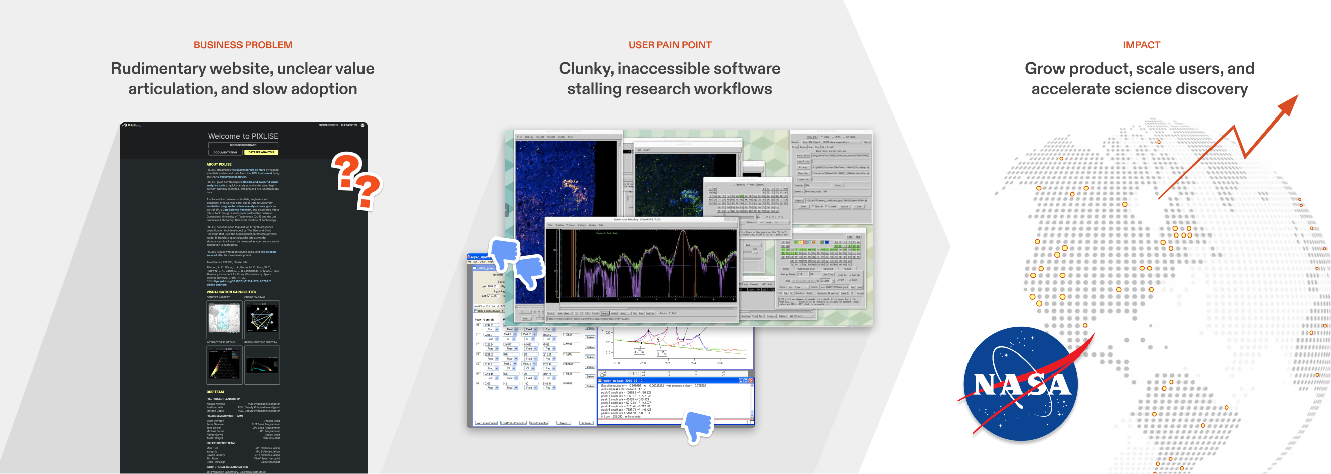
PIXLISE is a data analysis platform used by NASA’s Mars 2020 science team to study microscopic evidence of past life. Despite its scientific value, adoption capped at 20 users due to unclear positioning, slow onboarding, and fragmented communication.
As the first growth hire and second designer on the team, I designed PIXLISE’s public-facing website from 0→1, synthesizing discovery research, creating all technical content, and crafting the product’s initial deployment, onboarding, and messaging strategy. My design shipped in Spring 2023 and helped reposition PIXLISE as a mission-critical tool within frontier research workflows.
As the first growth hire and second designer on the team, I designed PIXLISE’s public-facing website from 0→1, synthesizing discovery research, creating all technical content, and crafting the product’s initial deployment, onboarding, and messaging strategy. My design shipped in Spring 2023 and helped reposition PIXLISE as a mission-critical tool within frontier research workflows.
Role: Lead Designer, Product Growth
Skills: UX/UI Design, Information Architecture, Content Design, User Research, Visual Design, Product Strategy, B2B Positioning & Messaging, Technical Communication
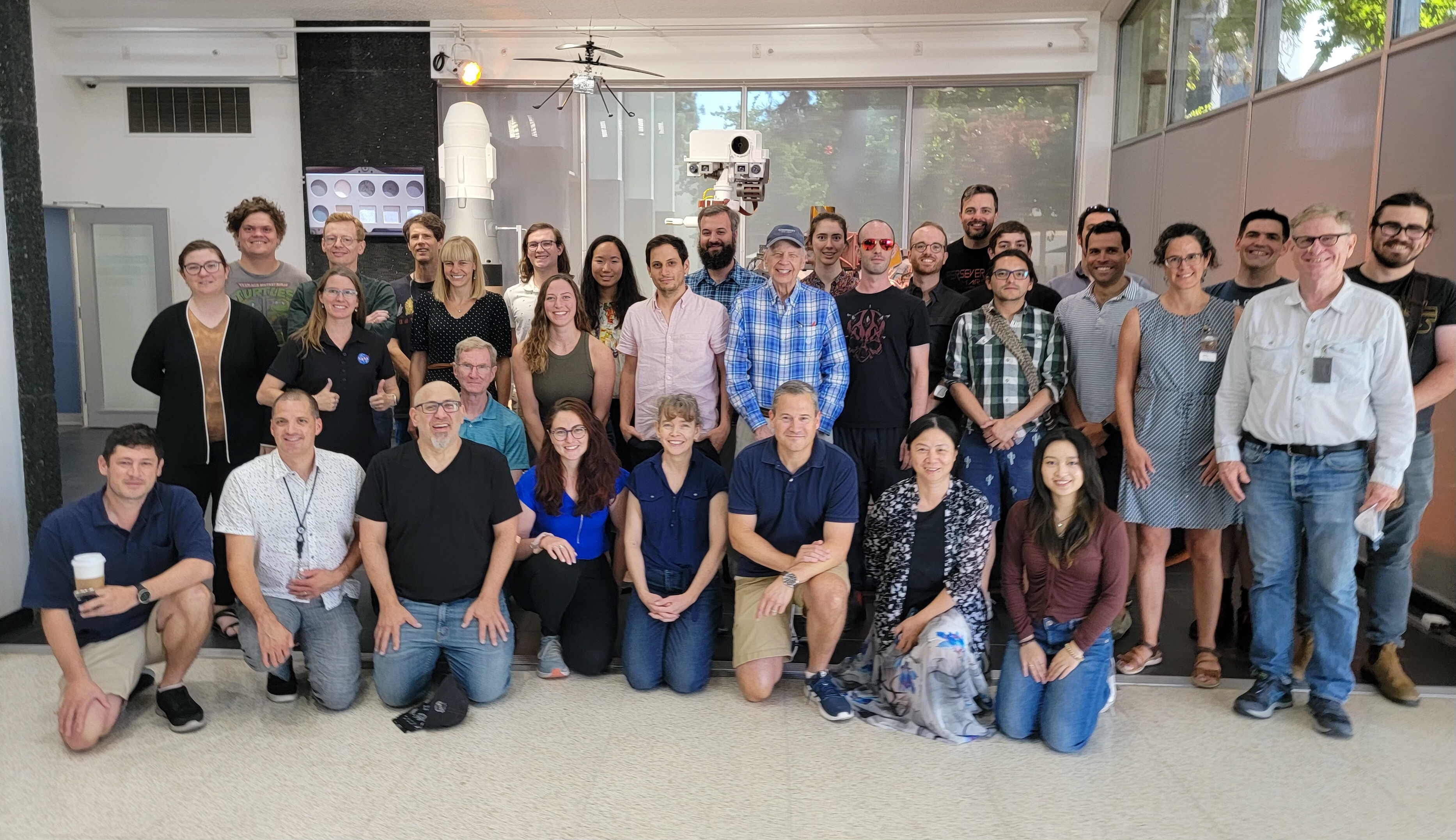
Client: Mars 2020 (PIXL) Science Team, NASA Jet Propulsion Laboratory
Duration: 10 weeks
Recognition: JPL Software of the Year Award 2023, NASA Software of the Year Award Runner-Up 2023

OPPORTUNITY
Establish PIXLISE as the go-to tool for spectroscopy analysis
PIXLISE’s public website used to be a static scroll of basic info, failing to communicate its current capabilities, much less its immense potential to fuel science discoveries beyond NASA. Diving deeper into planetary scientist and general research workflows, I uncovered opportunities to align PIXLISE’s capabilities with inefficiencies that plague modern research labs.
I turned pain points, access, and efficiency problems into an opportunity for growth.
Challenge
How might we leverage the unique capabilities of a planetary science tool to enable discoveries in broader science use cases?
DESIGN SOLUTION OVERVIEW
Time-to-insight: from weeks to minutes
PIXLISE’s public website addresses nuanced lab challenges and focuses on product literacy and scalable deployment. This expands PIXLISE’s reach to all geoscientists using XRF analysis.
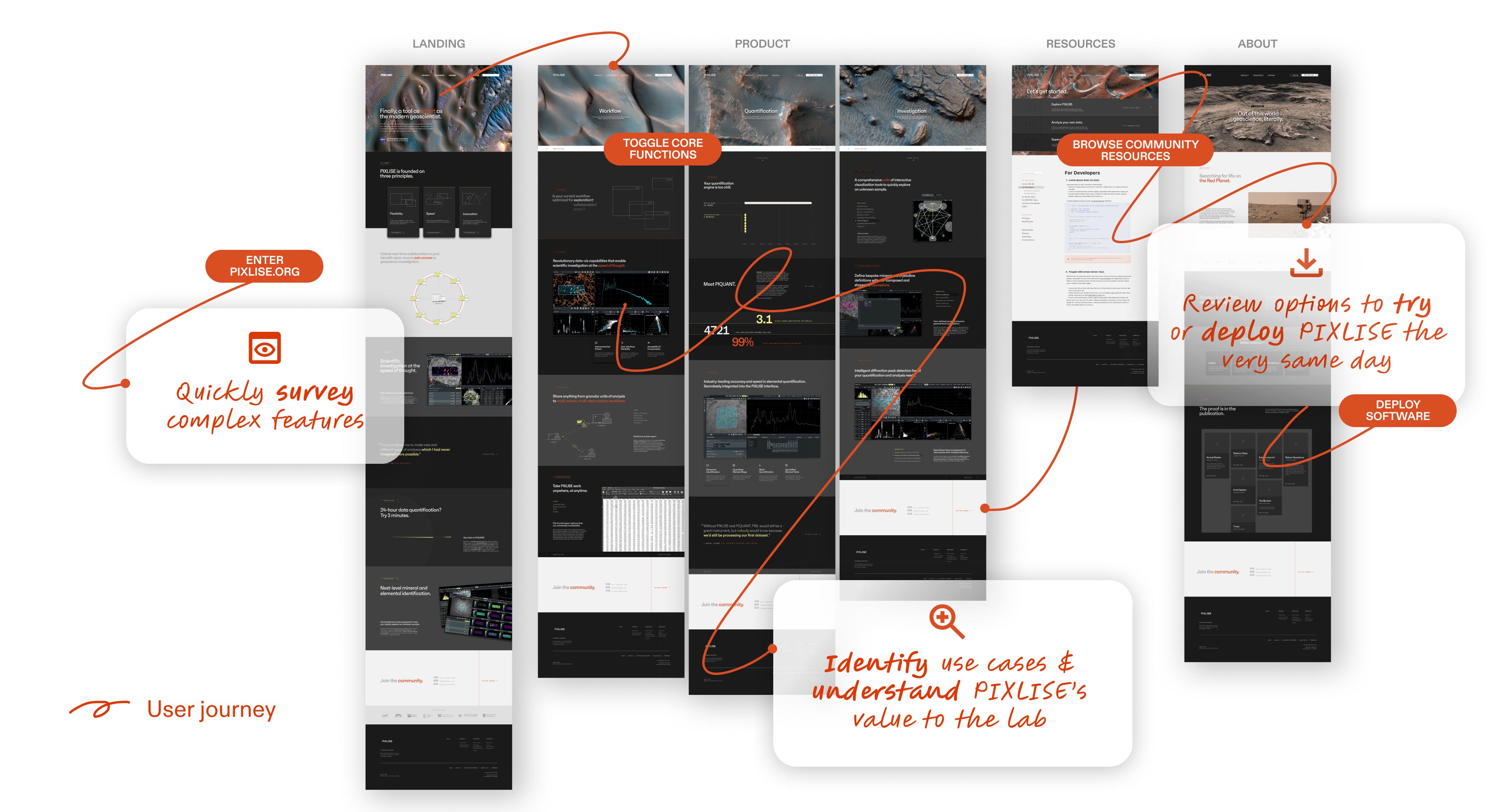
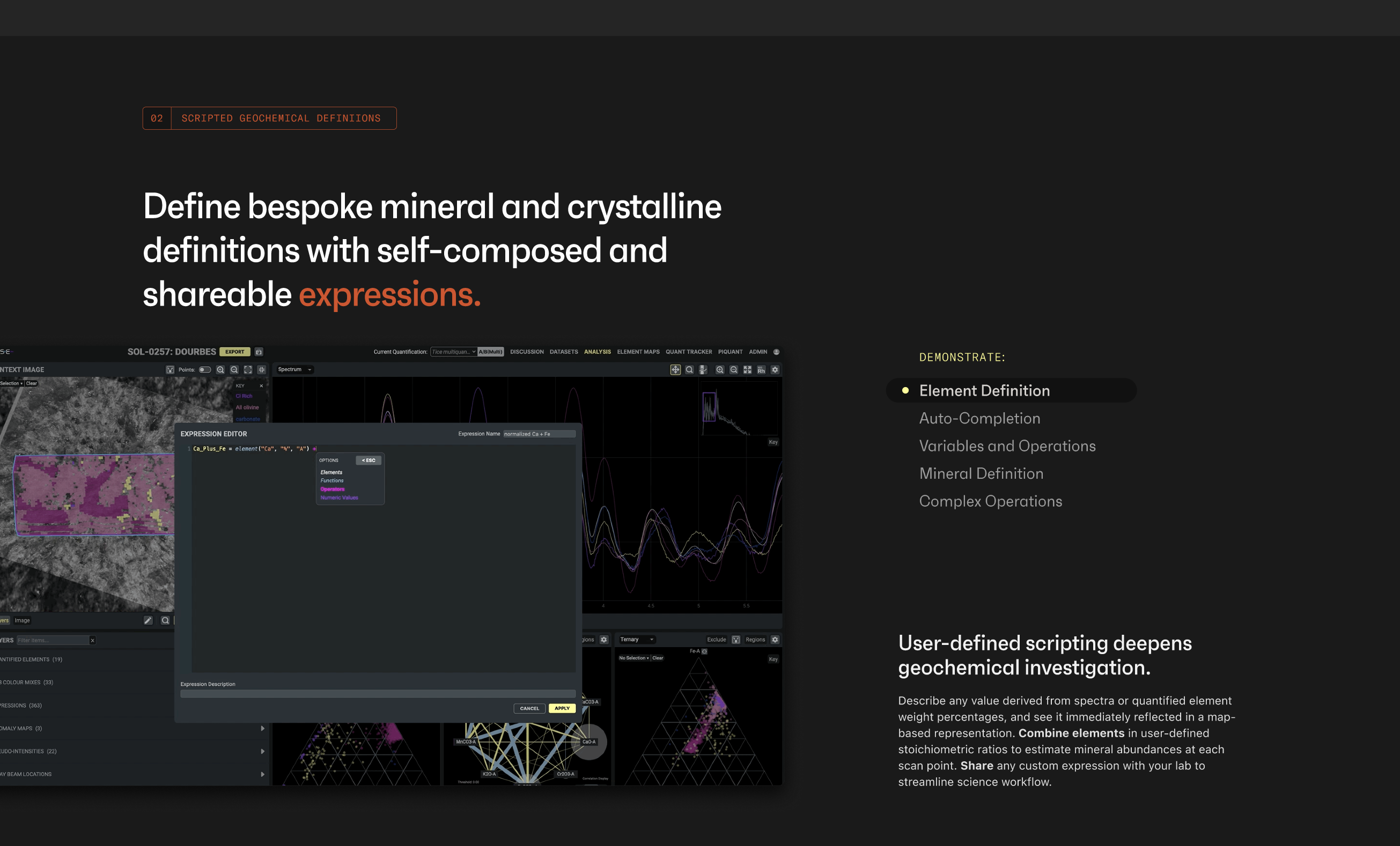
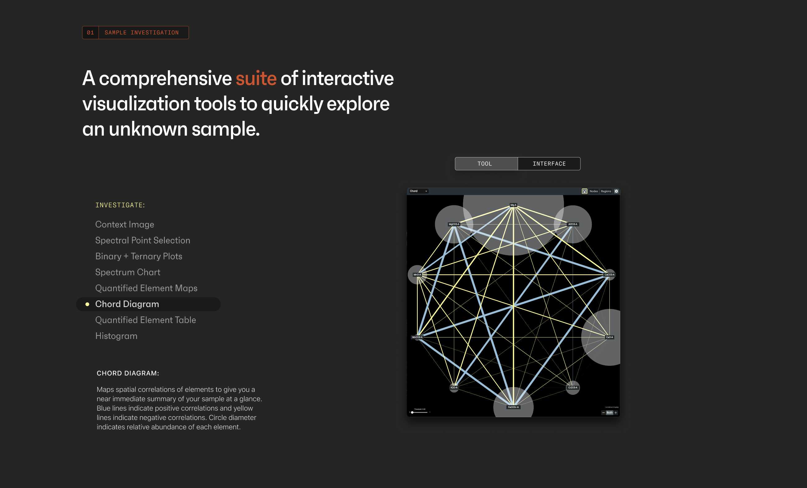
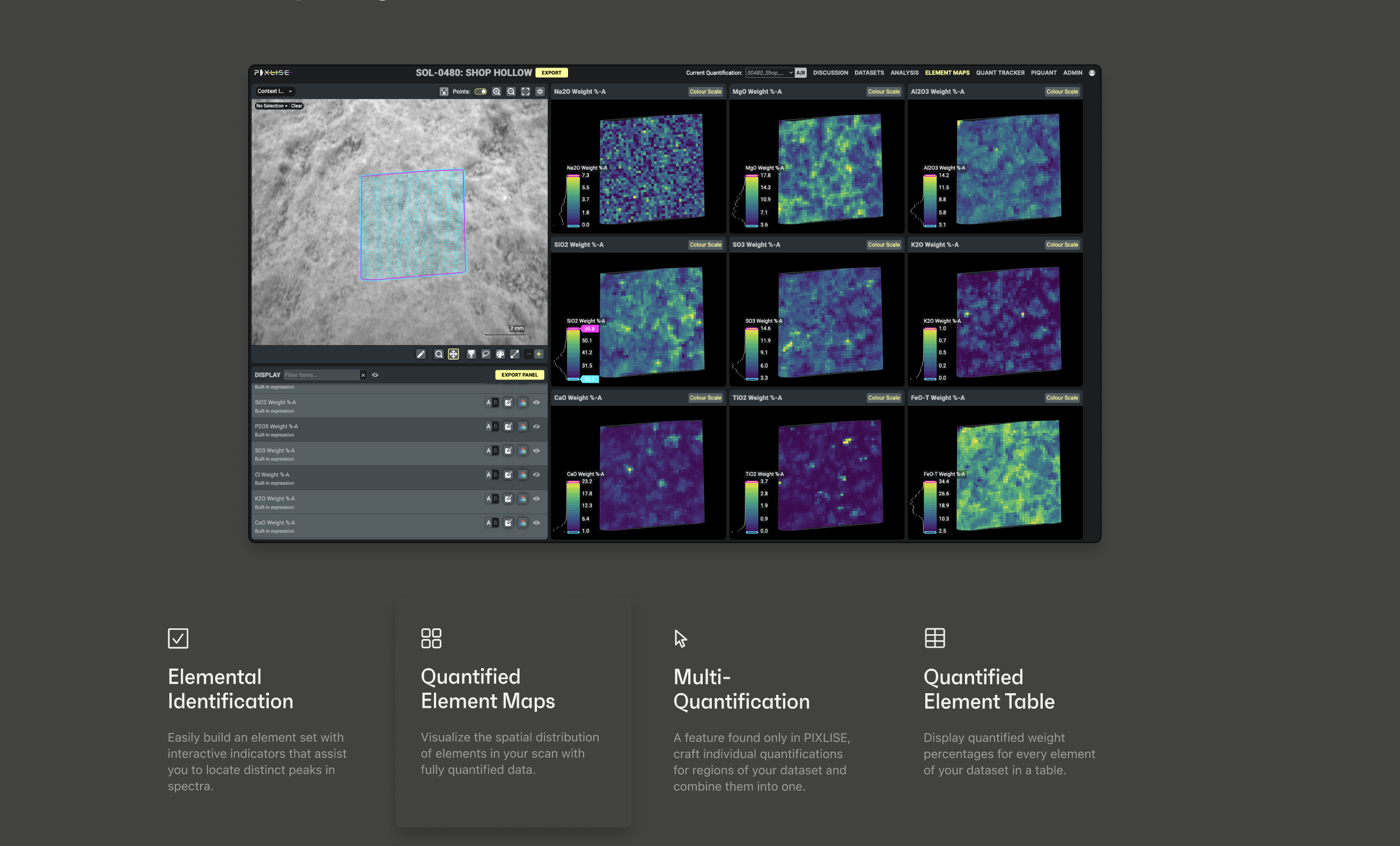
STEP 1: GRASP COMPLEX FEATURES IN SECONDS
Insight: Diverse accounts from depth interviews with PIXLISE users revealed the tool’s breadth and flexibility.
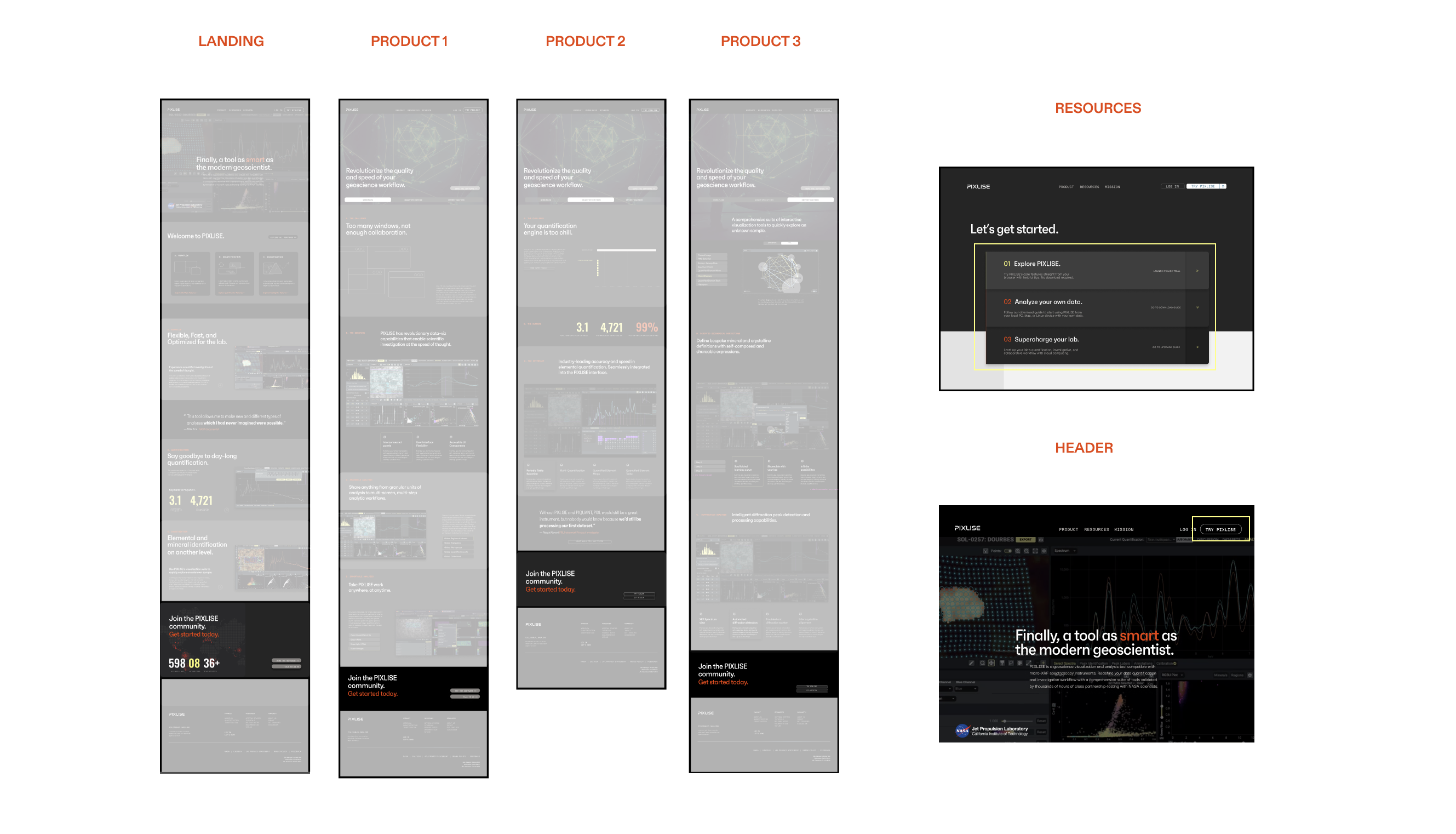
Solution: New landing and product pages capture PIXLISE’s features and unique value proposition across 3 core functions: Workflow, Quantification, and Investigation.
STEP 2: REIMAGINE SCIENCE COLLABORATION
Insight: Generative interviews with labs highlighted the importance of tools supporting interconnected workflows.
Solution: Product pages validate lab science challenges and highlight novel collaboration perks. Accessible navigation and links point to guides, forums, and other resources.
STEP 3: STREAMLINE ONBOARDING & ADOPTION
Insight: Demonstrating PIXLISE to research labs was slow and painful, spanning weeks via 1:1 calls.
Solution: Tiered plans and PIXLISE Trial replace lengthy demos, reducing onboarding to minutes. This simplified sales calls and freed team bandwidth to focus on shipping.
Result
We transformed a single-use tool into a research swiss army knife, enabling anyone to use PIXLISE.
THE BRIEF
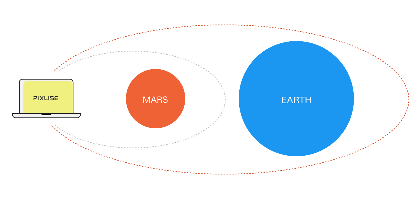
Mars science tools can be useful on Earth
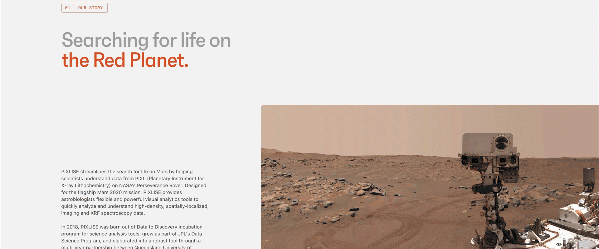
PIXLISE was designed to help scientists investigate the geological history of Mars from rock samples collected from the planet. Despite this specific use case, PIXLISE’s functions are applicable (and potentially revolutionary) to all elemental geoscience workflows.
NASA Jet Propulsion Laboratory’s PIXLISE team approached me to distill its capabilities into a compelling story to engage a new world of users.

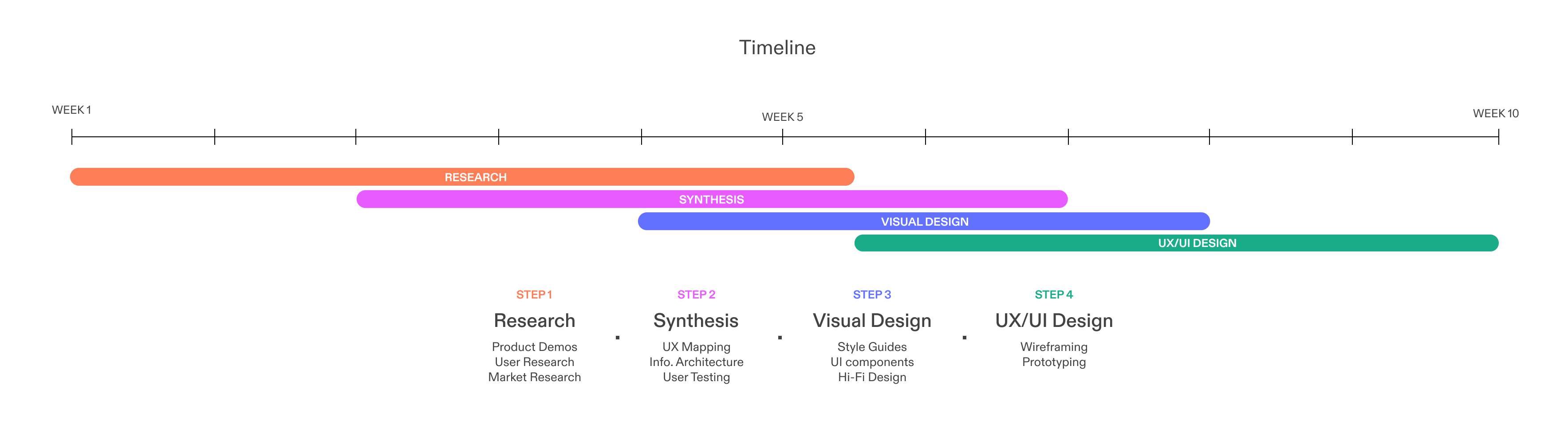
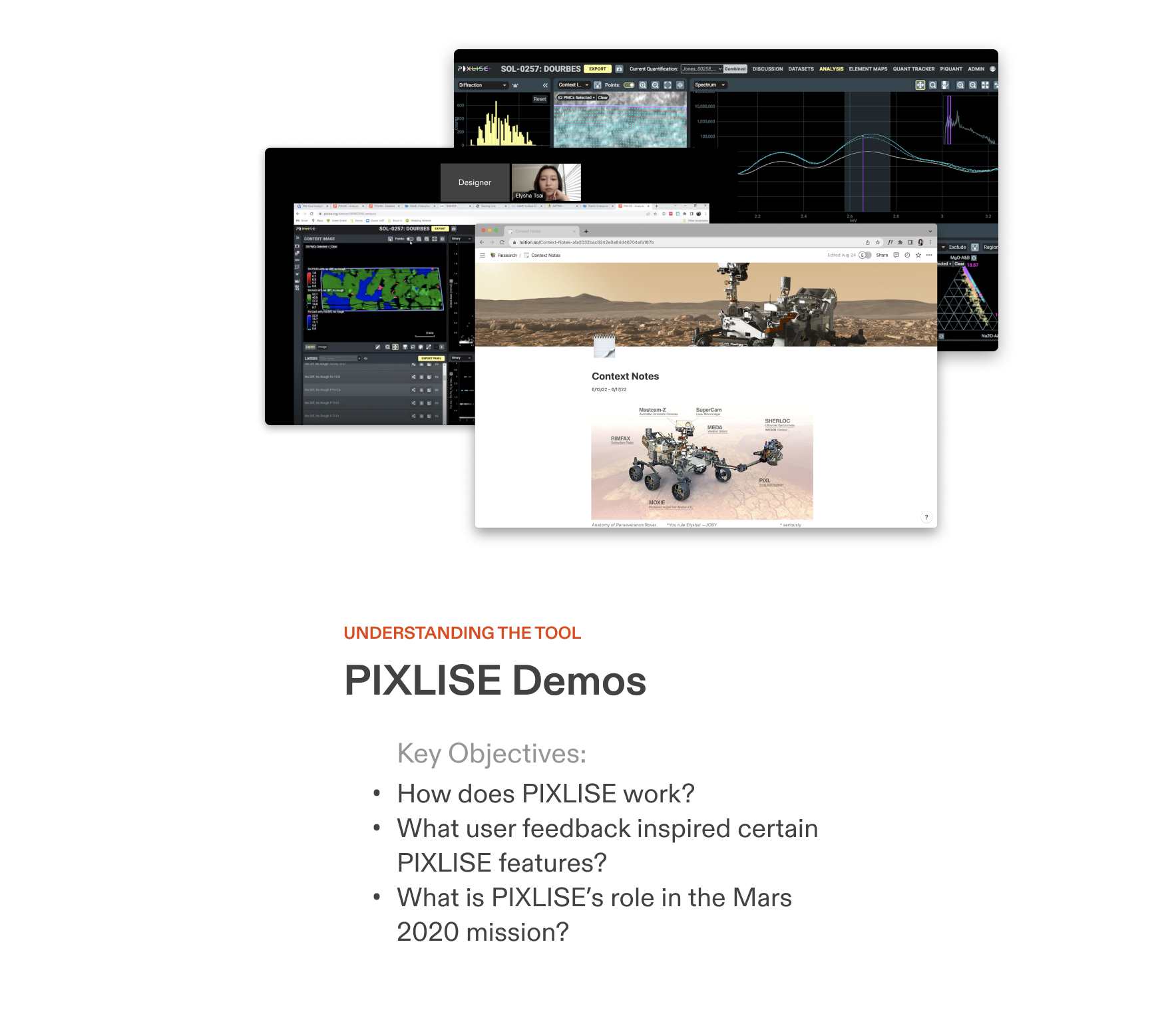
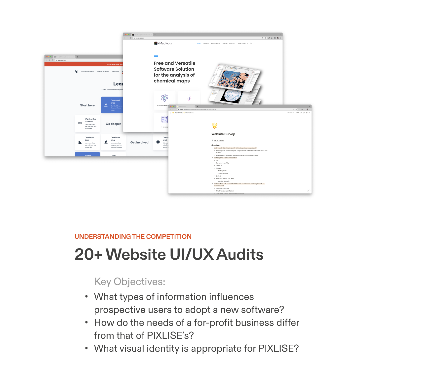
RESEARCH
Crash course in the product, existing users, business, and competition
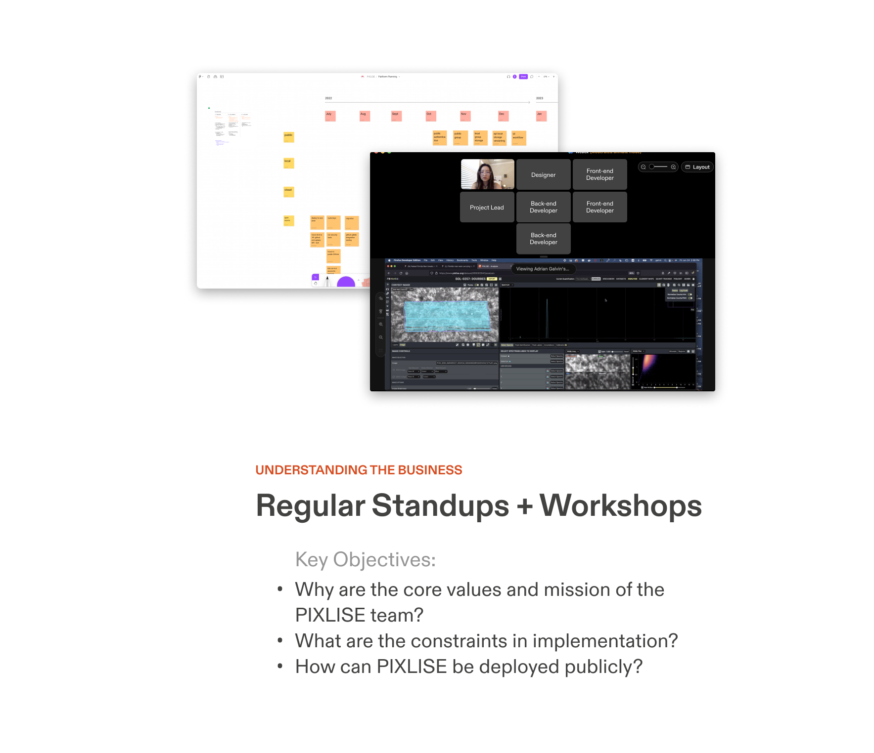
With research, I developed a deep understanding of PIXLISE’s capabilities via demos, interviews, audits, and workshops. The goal was to define a strategic plan to utilize the Mars use case, NASA positioning, and user insights to differentiate PIXLISE from market software in a favorable way.

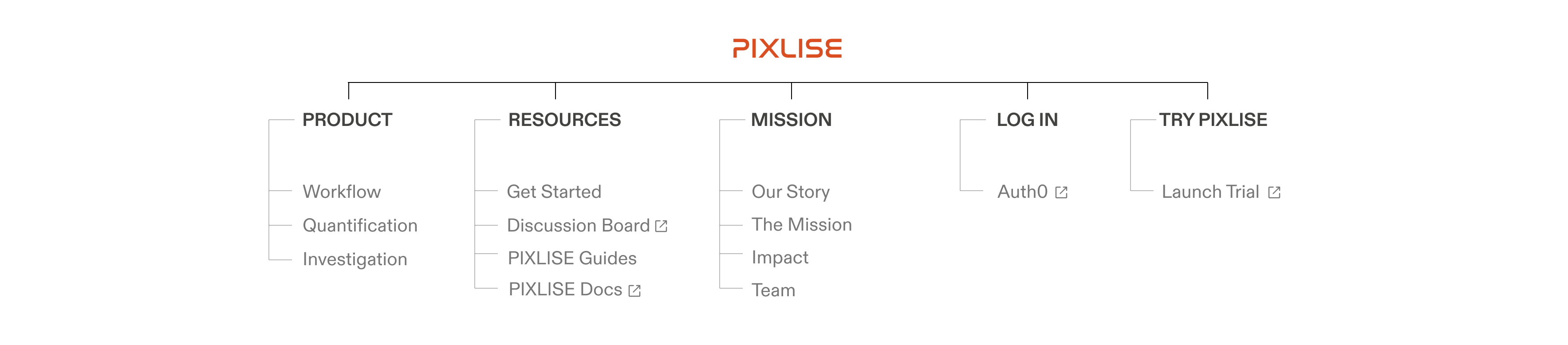
INFORMATION ARCHITECTURE / TAXONOMY
Diverse, nonlinear workflows demand detailed content organization
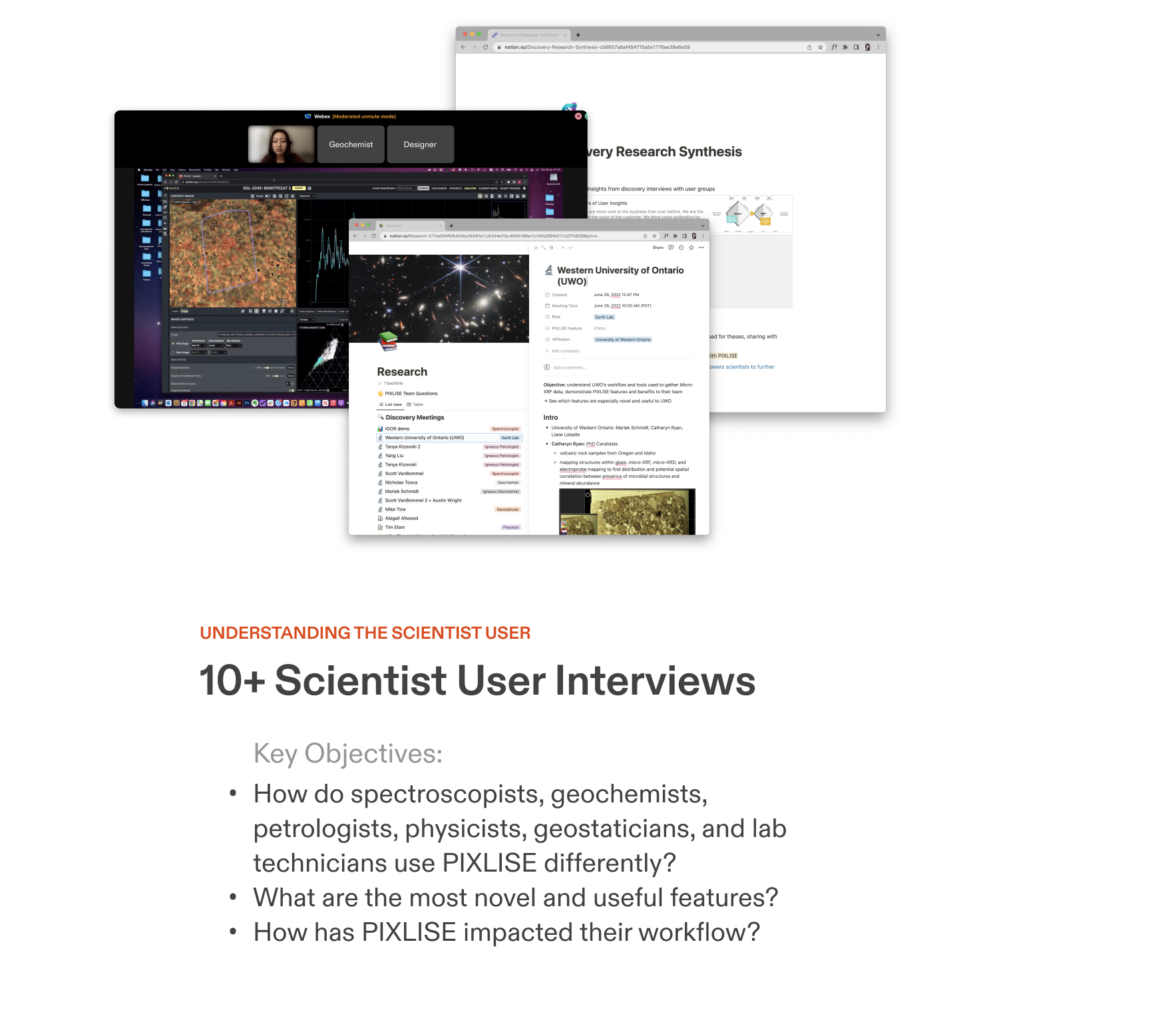
There’s no one “happy path” in scientific investigation. Through 15+ interviews and demos with scientist users, we were initially overwhelmed with the high variation in the features used and the ways they are utilized.
I identified patterns between these nuggets of information through prototyping artifacts and reviewing them with the product team and scientist experts. At last, I devised a comprehensive organization of product feature information with seven levels of granularity.
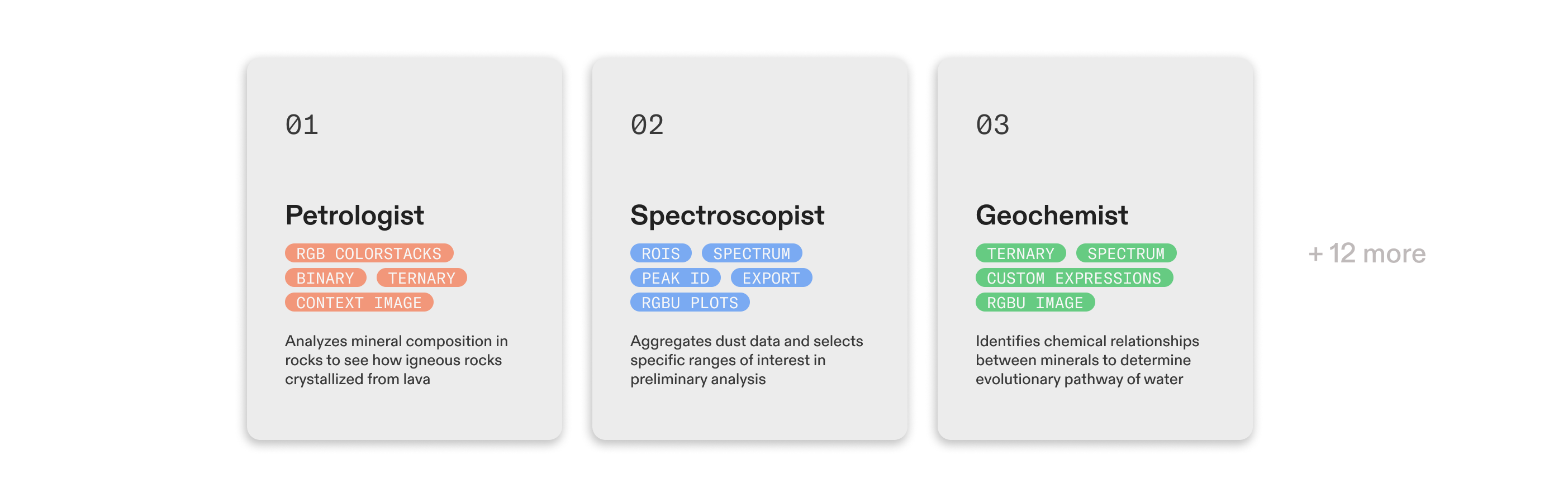


Product Values ✨
PIXLISE embodies flexibility, speed, and innovation.
The clear, structured taxonomy translated gracefully into the Landing and Product page wireframes, and is a huge improvement to the 4 cards on the site previously.

INFORMATION ARCHITECTURE / USER JOURNEY
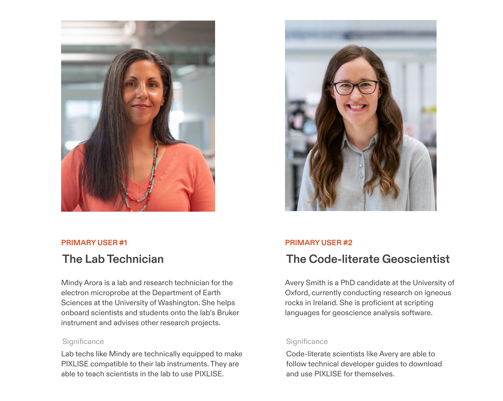
Lab challenges illuminate a plan for deploying PIXLISE
Despite a limited access to our target user, interviewing the University of Western Ontario’s X-ray fluorescence (XRF) lab validated a need for PIXLISE on Earth and helped us empathize with research lab scientists, who face distinct workflow struggles we were previously unfamiliar with.
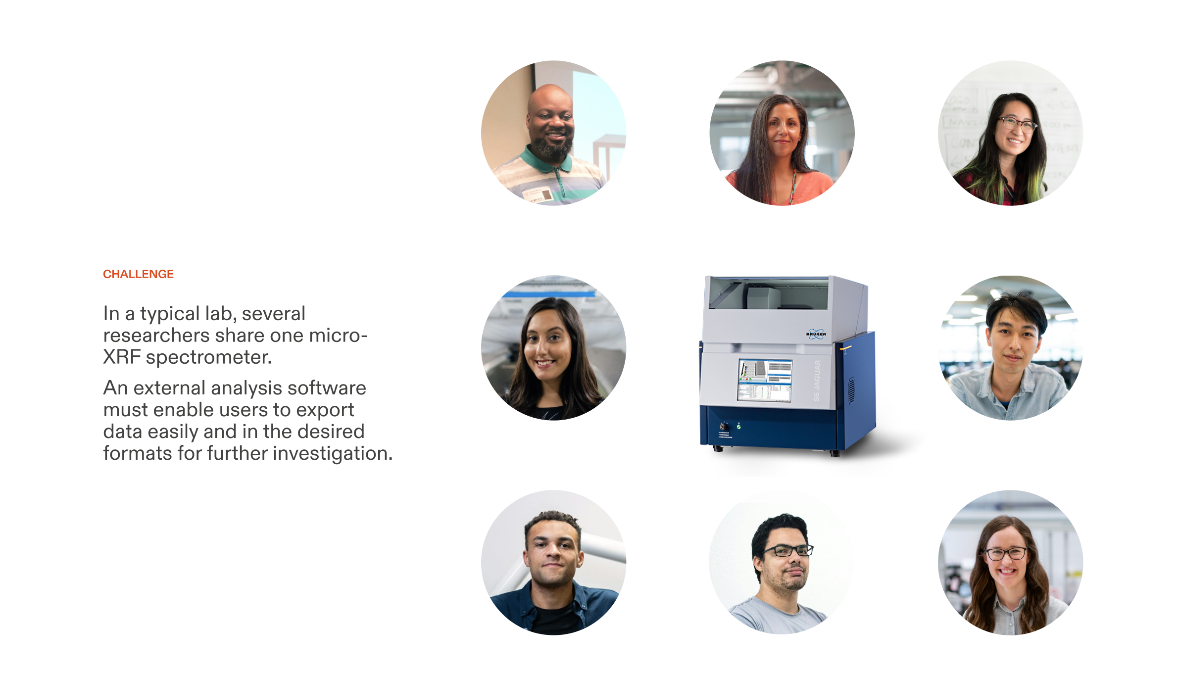
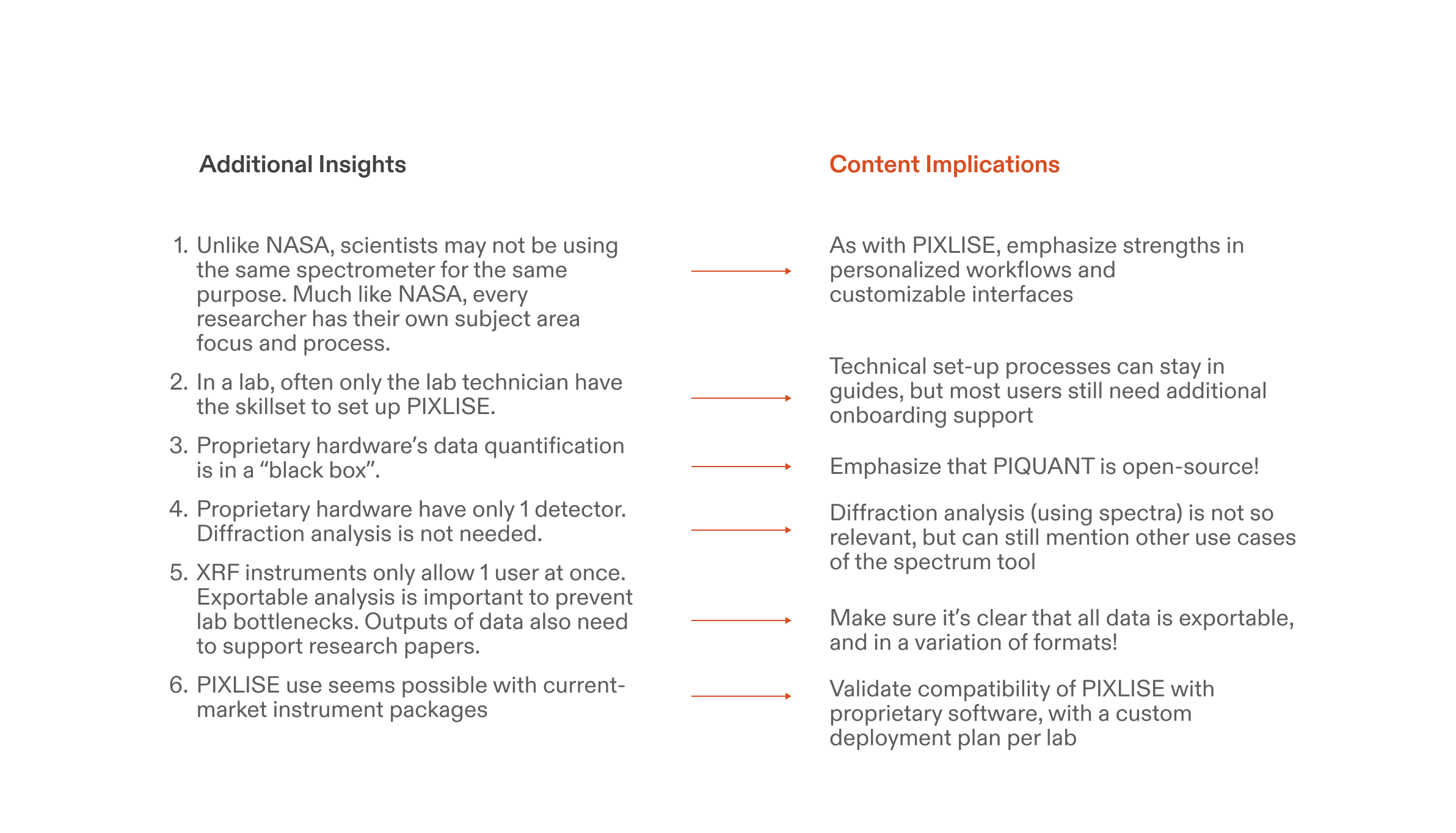
Insight 💡
Workflow agility, robust export functionality, and instrument-software compatibility are critical to addressing lab scientists’ hardware bottlenecks.
PIXLISE already had the features to address these user needs. However, new users may not be convinced right away that PIXLISE can even work with their lab’s tech stack, data, or research objectives.
I scaffolded this uncertainty by creating a tiered deployment plan.
I scaffolded this uncertainty by creating a tiered deployment plan.
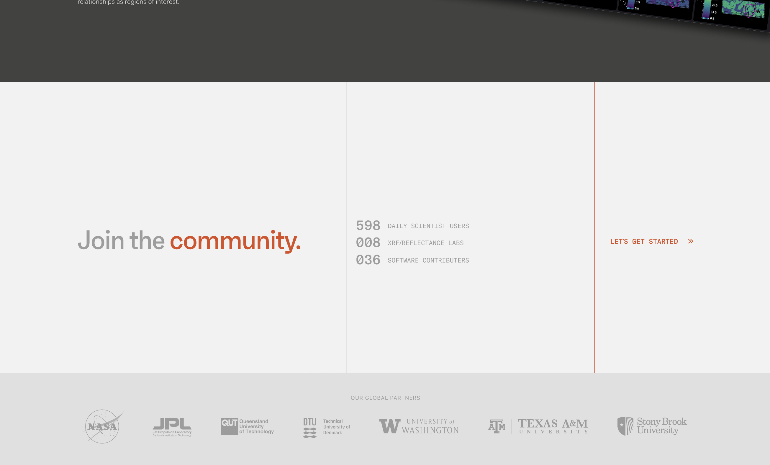
First, try PIXLISE with sample data. Then, secure PIXLISE for your lab when you know it’s a good fit. Later, experience PIXLISE at peak performance with cloud-parallelized computing. We simplified PIXLISE adoption even more with an ever-present “Try PIXLISE” button on the global navigation and a concise and engaging call to action and community metrics to end every page on the site.
INFORMATION ARCHITECTURE / STORY
Weaving product function into a narrative
I found an opportunity to showcase PIXLISE’s unique history beyond its awesome features. In the Mission page, we highlight the Mars story as an additional reason to love PIXLISE. PIXLISE’s “mission” statement strategically follows its origin story and continued presence in NASA’s flagship Mars 2020 mission.
This completes the arc of the public PIXLISE experience:
Show off product features first, reinforce with community resources, and seal the deal with an otherworldly mission statement.
IDENTITY
Refreshed design system engages the technical user
I led PIXLISE’s design system evolution to target new research audiences. The refreshed visual design reflects the sophistication and quality of the revolutionary tool, while maintaining a tone of warmth through its mission to enrich the science community.


I worked with our Founding Designer and devs to design bespoke components and document design guidelines that bridge marketing with core product’s look and feel.

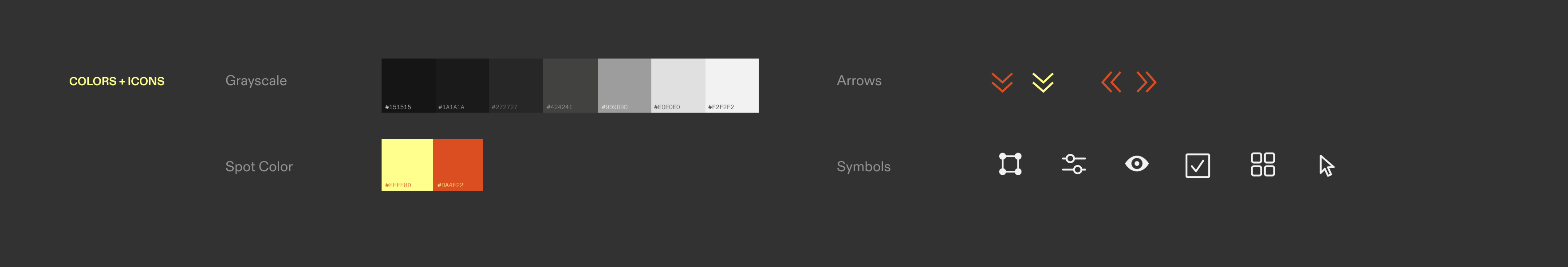
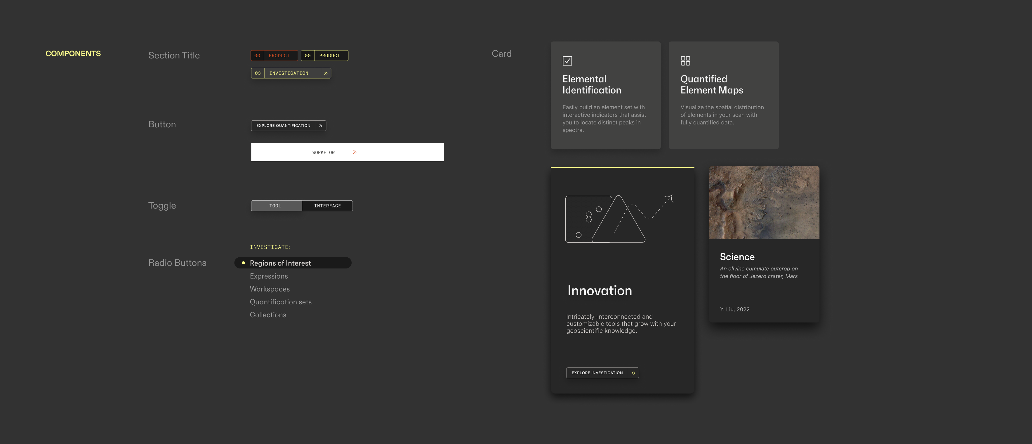
Visual Design Rationale 🧐️
The design system retains the dark look of the UI. We highlight with PIXLISE’s recognizable yellow spot color, now coexisting with an additional poppy vermillion, inspired by Mars. An energetic type duo ties it all together: the geometric yet approachable sans serif Faktum and the clean monospace variation of GT America.
The design system retains the dark look of the UI. We highlight with PIXLISE’s recognizable yellow spot color, now coexisting with an additional poppy vermillion, inspired by Mars. An energetic type duo ties it all together: the geometric yet approachable sans serif Faktum and the clean monospace variation of GT America.
COMMUNICATION DESIGN
Optimizing visuals for understanding
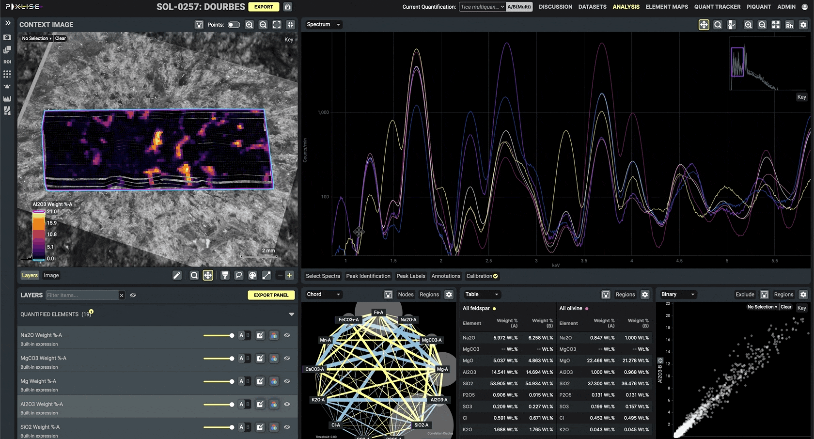
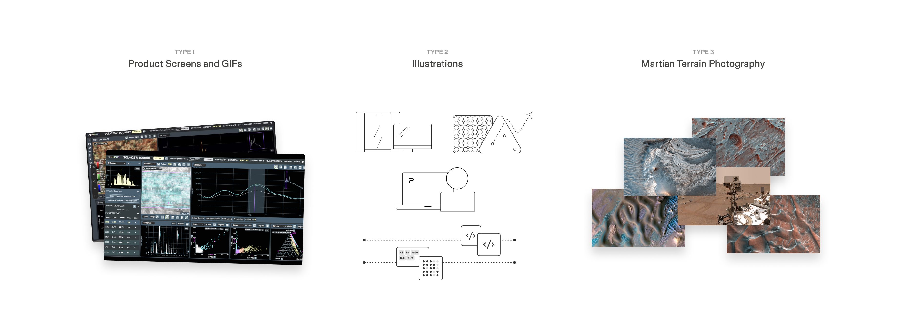
In early iterations, I relied solely on product screens to visualize PIXLISE benefits. Although great for demonstrating how a scientist might use PIXLISE, these failed to communicate abstract product benefits, such as “real-time collaboration” or “open-source web access.”

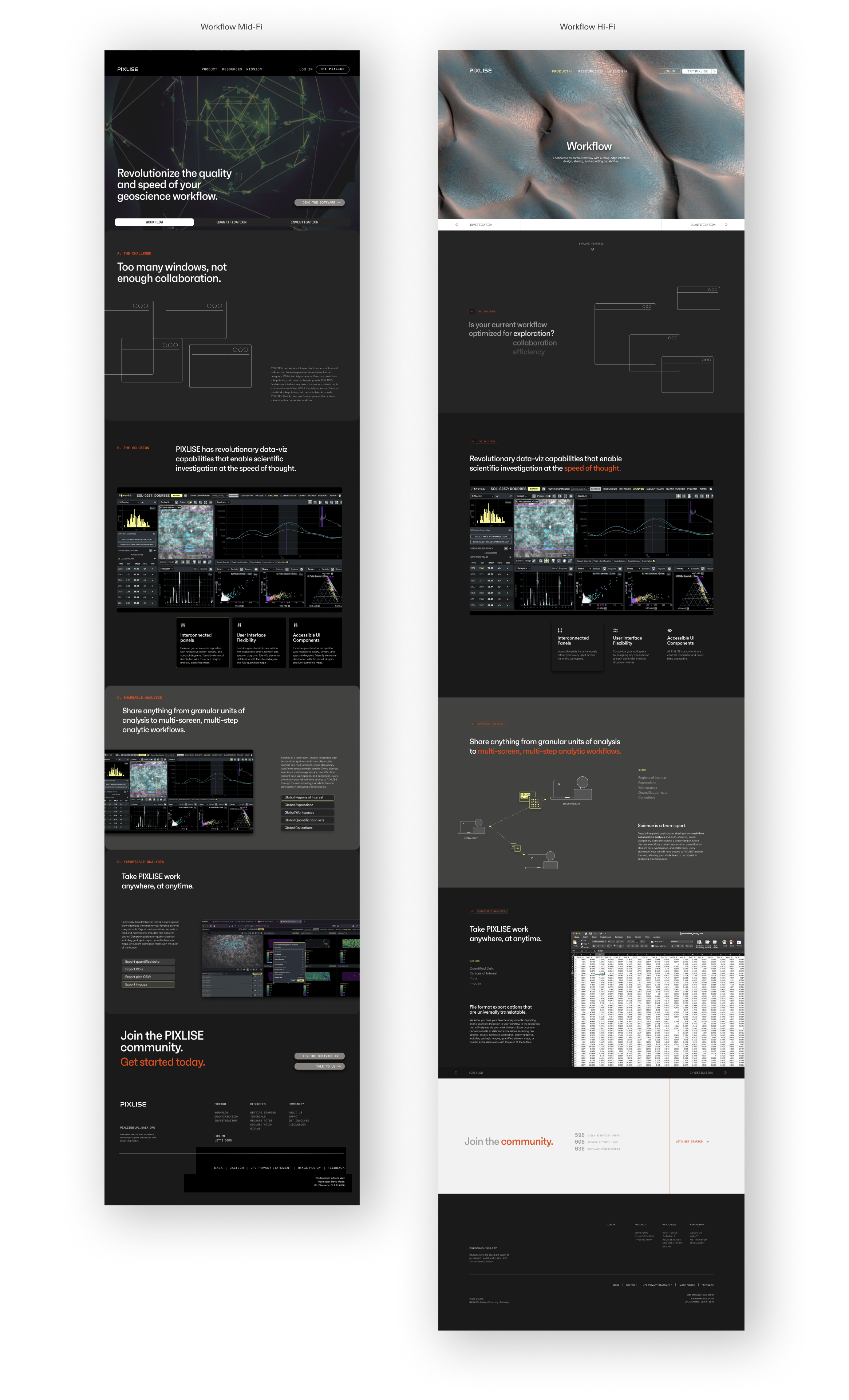
In later iterations, using lighter backgrounds afforded a refreshing differentiation from the product UI. Simple illustrations helped convey higher-level concepts and high-res geography photos supplemented context and atmosphere.
To reduce user cognitive load, I designed custom interactions that scaffold complexity and create opportunities of discovery. Some microinteraction highlights:
︎ Click on informational cards to survey product features quickly.
︎ Easily navigate between the three core product functions: Workflow, Quantification, and Investigation.
︎ Switch between an isolated panel view and an in-context workspace view to immediately grasp tool functionality.
Interact with the final prototype here.
REFLECTION
Learnings and next steps
Despite the ambiguity of our target user and high level of content complexity, I designed a product’s growth strategy and public interface in 10 weeks. My greatest breakthrough was learning to be wrong, so we can get it right together.
More learnings:
Writing is design. Balancing precision, concision, and accuracy with something more “punchy” and “marketable” was hard and required its own iterative process.
Asking good questions is good, but prototyping wrong solutions is better. I had to confront my perfectionism in the face and build out some terrible artifacts before they started to become clear. The goal is to move the needle forward.
Design creates access. Working with technical stakeholders helped me contextualize the importance of design in a high-complexity setting. Seeing design’s ability to bridge connections, disciplines, workflows, and understanding within just a few months made the challenges along the way so worthwhile.
If given more time and money, I’d:
Access more Earth labs. It was challenging extrapolating findings with limited access to our target user. In an ideal world, I would interview and test with more earth scientists to validate site success.
Build out guides. PIXLISE is not easy to learn and user support is necessary to troubleshoot and adapt to software changes. I’d love to continue working with users and PIXLISE developers to build user-friendly guides for user autonomy.
Be more hands-on with deployment.
Through this experience I realized I enjoy working with eng stakeholders to ensure ideas are grounded in reality. If afforded more time I’d love to be more involved with designing the back-end for PIXLISE’s sustained growth.
Presenting the website to the Mars 2020 PIXL science team was the most gratifying moment of my career to date. I got to see scientists react to my process and get a glimpse of the positive impact design can have on scientific inquiry. This project reinforced my belief in the necessity of human-centered design.
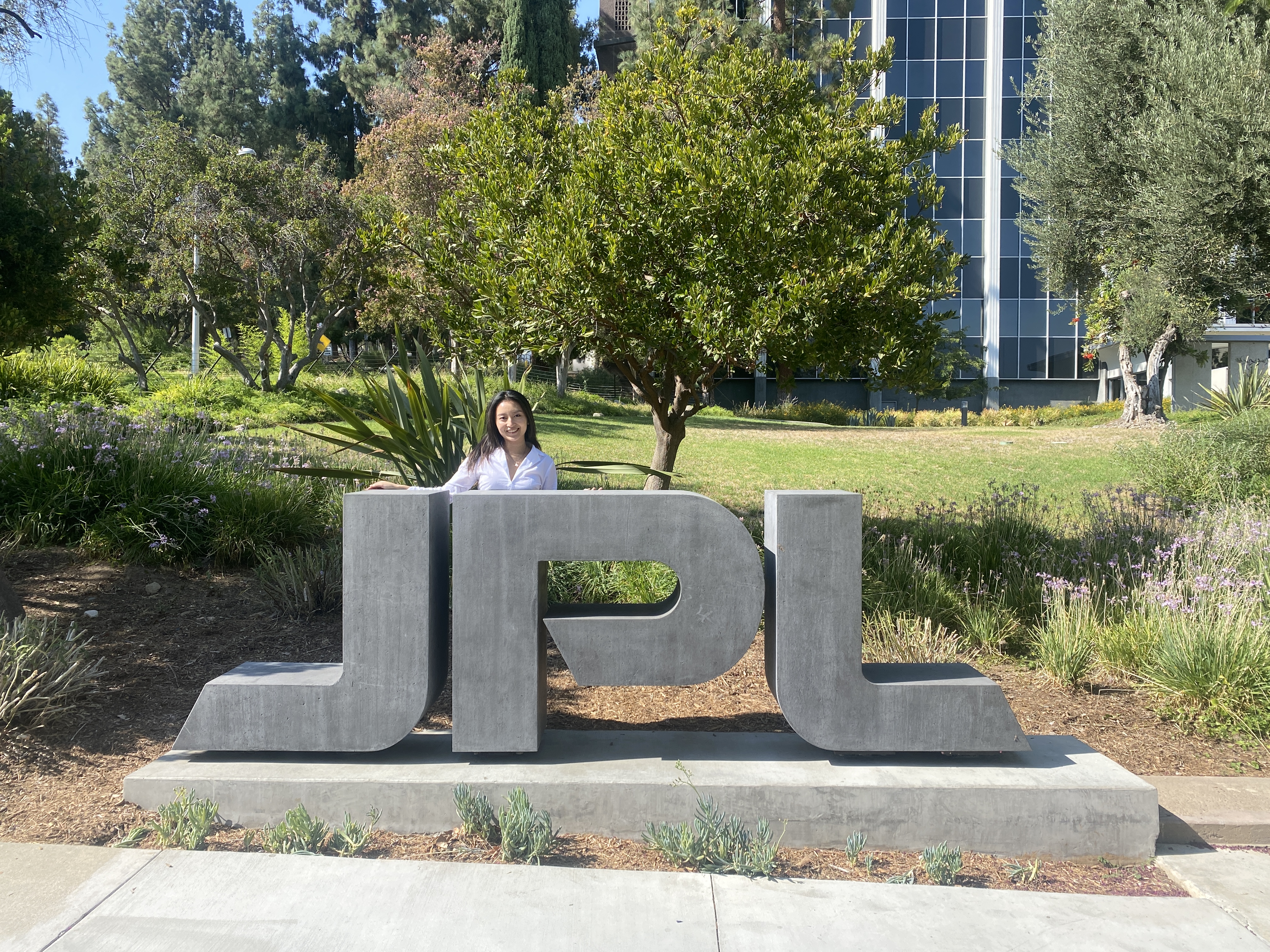
2024 Update—
Now, I’m working on strategic visual communication solutions for science/engineering at NASA JPL, see here︎︎︎
2024 Update—
Now, I’m working on strategic visual communication solutions for science/engineering at NASA JPL, see here︎︎︎
Thanks for reading!