Seeing the creative industry through the lens of color
#HUEAREYOU translates the AIGA Census into a language familiar to our work. This site visualizes the broad spectrum of priorities, skillsets, and personal values of over 9400 creatives in the design industry.
As a UX and Visual Designer, I contributed to this website’s logical implementation, novel user flow, and visual cohesion. I also led the interface design for the landing (About) and explore page.
Site shipped in Spring 2022. 🌈

Role
Skills
Team
Tools
Duration
Overall site UX
UI Designer
Visual Designer
UI Designer
Visual Designer
UI/UX Design
Data Visualization
Visual Design
HTML/CSS
Data Visualization
Visual Design
HTML/CSS
Jenny Liu
Chris Han
Gary Tang
Chris Han
Gary Tang
Figma
Tableau
HTML/CSS/JS
PHP
Tableau
HTML/CSS/JS
PHP
7 weeks
DESIGN BREAKDOWN
We leveraged impersonal industry data to takes users on a colorful journey of self-discovery, starting with a personality quiz. Generate personalized color summaries and illuminate empowered connections with like-minded creatives who share common values in the profession.
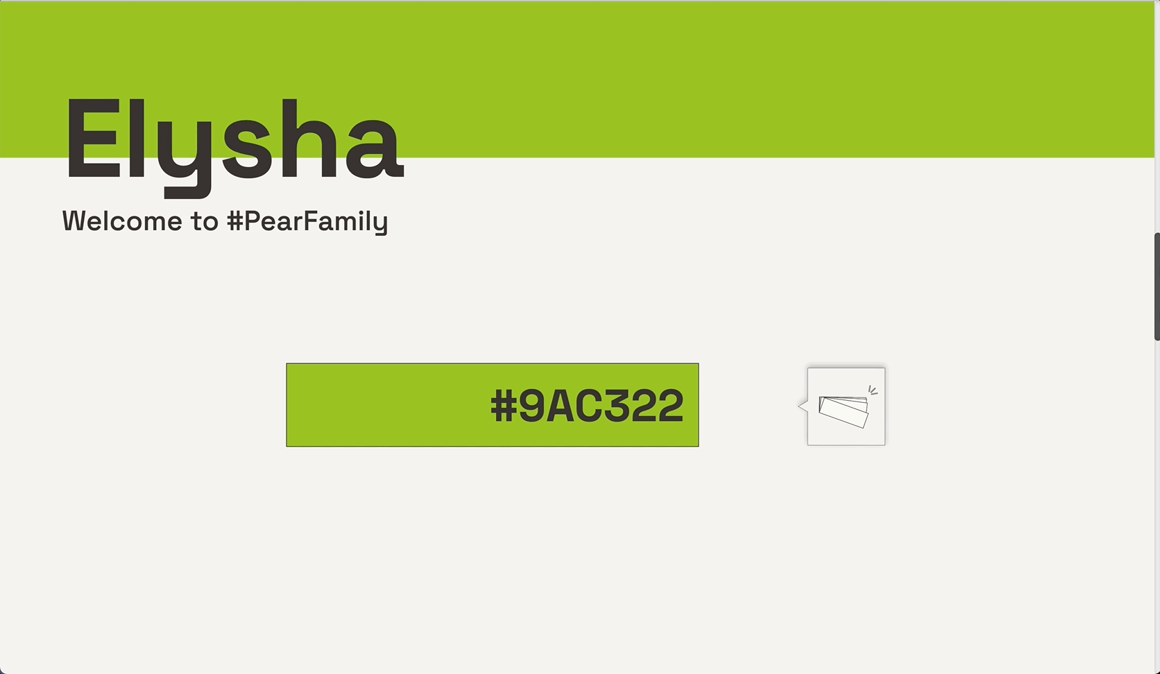
Hi, I’m Elysha—#9AC322 and #PearFamily. Hue are you?
We leveraged impersonal industry data to takes users on a colorful journey of self-discovery, starting with a personality quiz. Generate personalized color summaries and illuminate empowered connections with like-minded creatives who share common values in the profession.


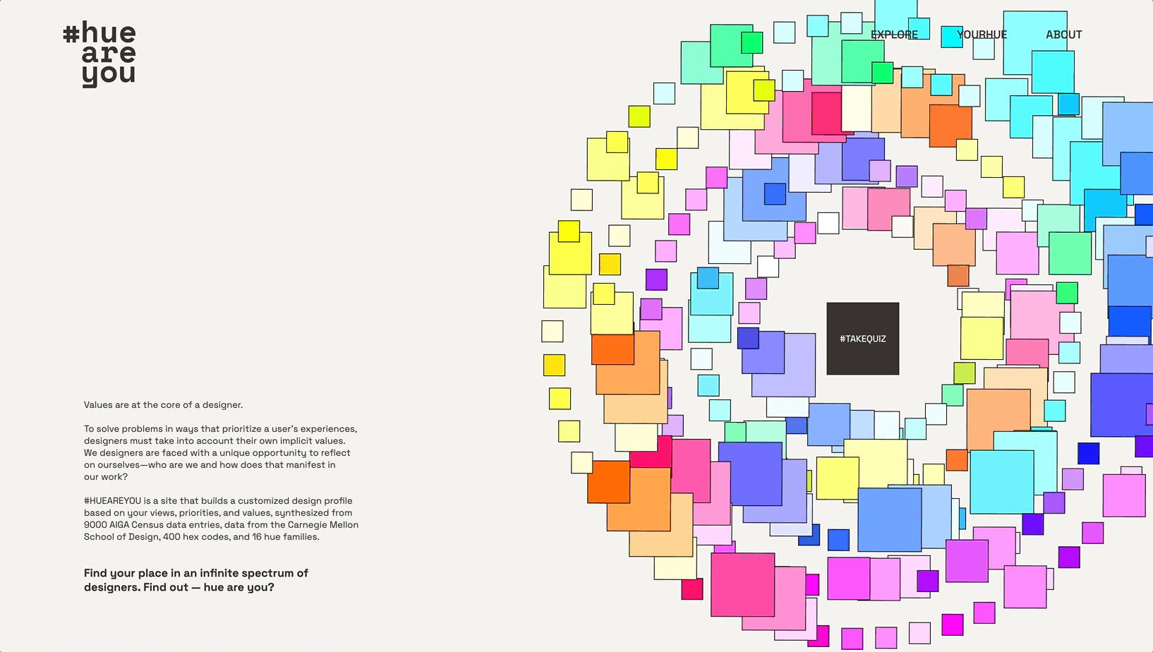
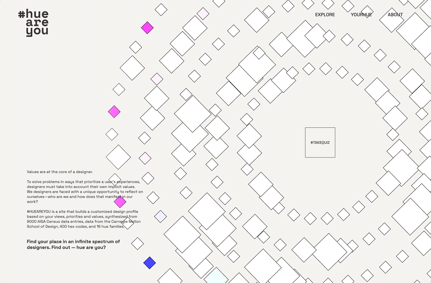
1. Enter the Experience
An interactive visualization previews the dataset and site concept, debuting the recurring square motif. Some “about” context and mouse-responsive interaction guides users to take the quiz.
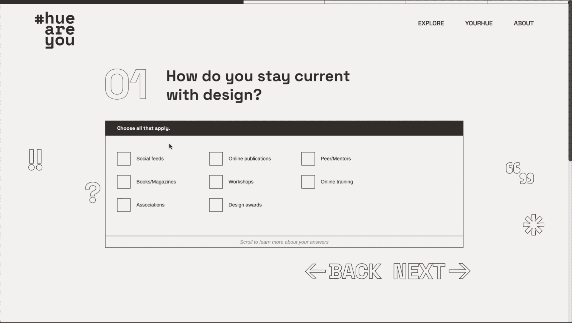
2. Take the Quiz
Before exploring the AIGA Census in full, get introspective with 6 multiple-choice questions about the design industry and your design ethos.
P.S. — We made this process fun by adding card-flipping and easter egg interactions to tease fun facts from the census!
P.S. — We made this process fun by adding card-flipping and easter egg interactions to tease fun facts from the census!

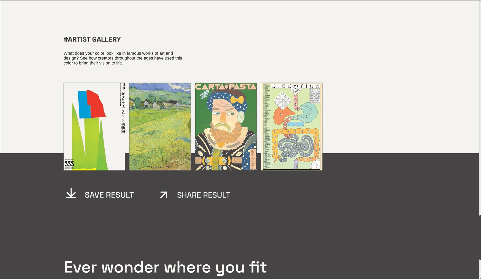
3. Reveal your Personal Result
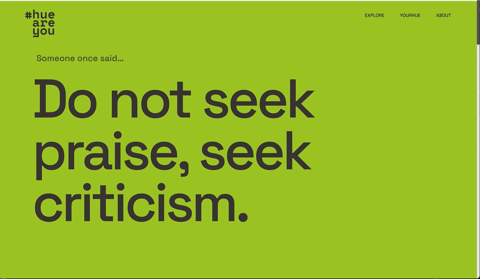
#HUEAREYOU generates a customized color profile based on your quiz responses. Scroll to reveal a quote from a famous designer, your unique hex code, color family (people who share your top value), and more.
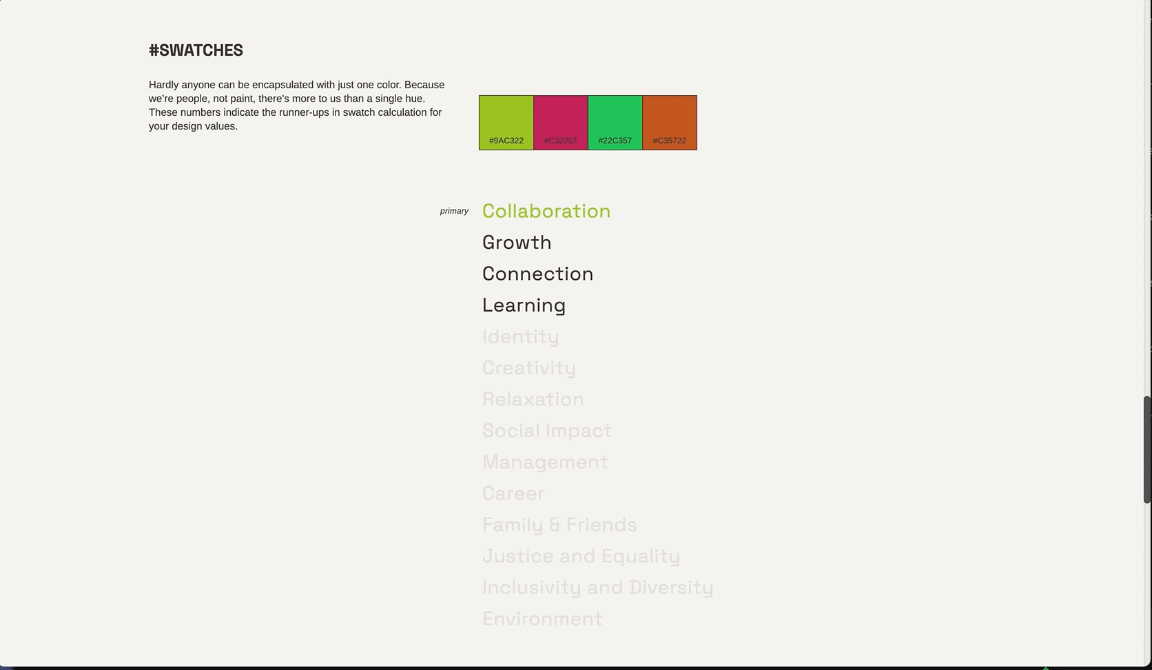
P.S. — Click on the swatchbook to see a breakdown of your color result based on hue, saturation, and luminance.
P.S. — Click on the swatchbook to see a breakdown of your color result based on hue, saturation, and luminance.
Identifying that creativity was a simultaneously unifying and lonely superpower at times, we wanted creatives to feel understood and validated in their outlook and process.
4. Explore the Community
My color is cool, but now what? I shipped the Explore page design, a playground that displays all community data (400 possible color results!) as swatches.
Scroll, reveal demographic swatchcards, and use the toolbar to fine-tune your exploration of 9,304 data points, hex codes, and hue families.
Scroll, reveal demographic swatchcards, and use the toolbar to fine-tune your exploration of 9,304 data points, hex codes, and hue families.
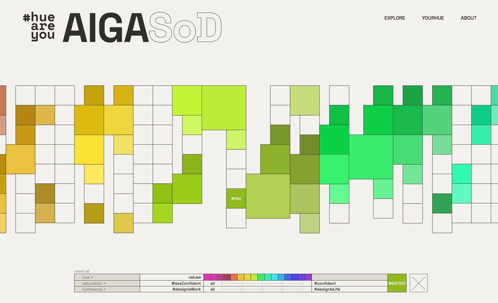
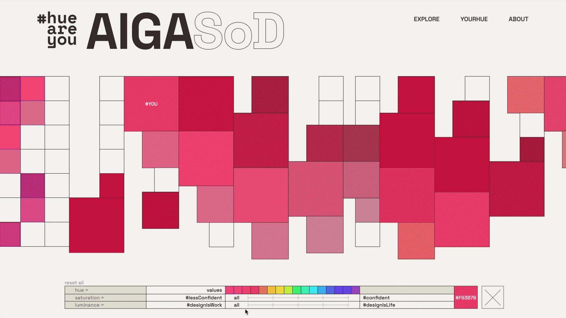
The shortcut button helps uses jump straight to #YOU. We made the interactive toolbar equal parts informative and functional, helping users narrow their exploration while uncovering how their color result came to be.
Ultimately, we hope to inspire creatives to embrace their unique strengths, find their community, and discover more reasons to create... through play.
