Activating Mars mission software on Earth
PIXLISE is a data analysis tool used by a small NASA science team to search for life on Mars. It struggled to exceed 20 users, but the team knew it had the potential to change the world.
As the sole designer, I partnered with science and product teams to design the public-facing website from 0 to 1, generate all technical content, and craft the product’s initial deployment and messaging strategy for growth.
Design fully implemented in Spring 2023. 🚀
As the sole designer, I partnered with science and product teams to design the public-facing website from 0 to 1, generate all technical content, and craft the product’s initial deployment and messaging strategy for growth.
Design fully implemented in Spring 2023. 🚀

Role
Design Lead
Design Lead
Skills
UX/UI Design
Info Architecture
Content Strategy
UX Research
Copywriting
Visual Design
UX/UI Design
Info Architecture
Content Strategy
UX Research
Copywriting
Visual Design
Client
NASA Jet Propulsion Laboratory
(PIXL Science Team)
NASA Jet Propulsion Laboratory
(PIXL Science Team)
Duration
10 weeks
10 weeks
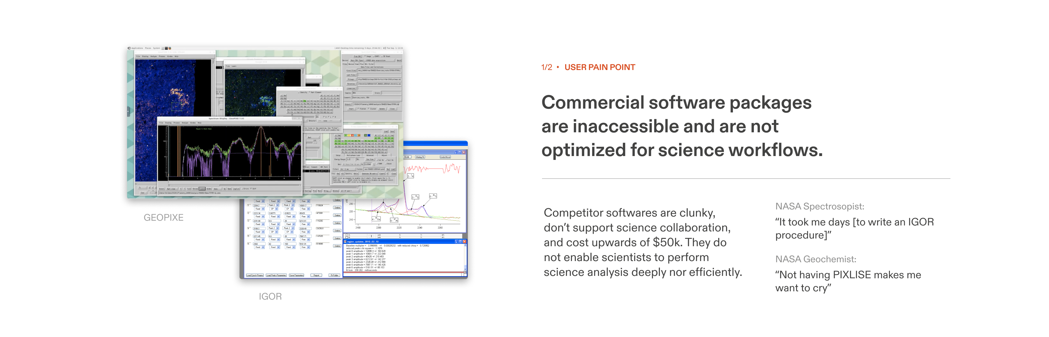
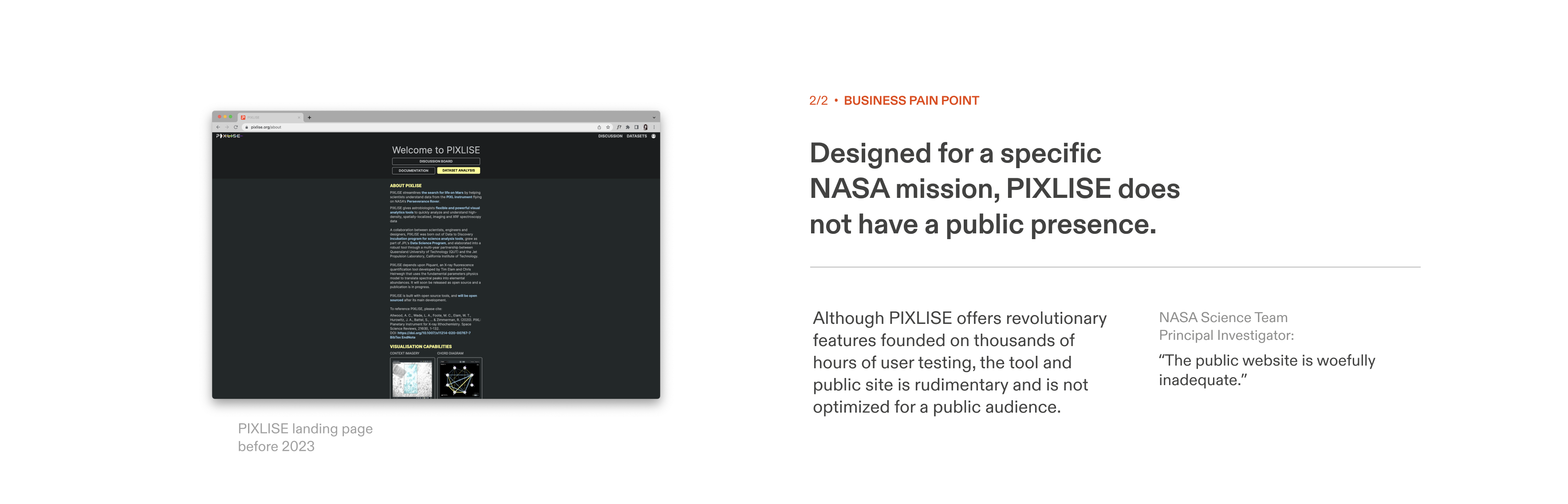
PROBLEM
Previously, PIXLISE’s front page contained basic overview information that failed to communicate PIXLISE’s immense potential to fuel science discoveries beyond NASA.
Further, my research into this problem space uncovered skill and workflow gaps that plague the efficiency of research labs. I witnessed our growth strategy evolve the product roadmap to serve grander needs of the entire science community, enabling universal scientific discovery!
PIXLISE is one-of-a-kind, complex, and inaccessible to most of the world
Previously, PIXLISE’s front page contained basic overview information that failed to communicate PIXLISE’s immense potential to fuel science discoveries beyond NASA.
Further, my research into this problem space uncovered skill and workflow gaps that plague the efficiency of research labs. I witnessed our growth strategy evolve the product roadmap to serve grander needs of the entire science community, enabling universal scientific discovery!
Challenge

SOLUTION OVERVIEW
Now, PIXLISE is accessible to all geoscientists. Quickly survey complex features and potential use cases, understand PIXLISE’s value to your lab, and take steps to deploy powerful software the very same day.
Enabling all geoscientists to make groundbreaking discoveries with PIXLISE
Now, PIXLISE is accessible to all geoscientists. Quickly survey complex features and potential use cases, understand PIXLISE’s value to your lab, and take steps to deploy powerful software the very same day.


Turning our attention to other scientists, we transformed a tool for a singular mission into a research swiss army knife.
How it works in 3 steps:
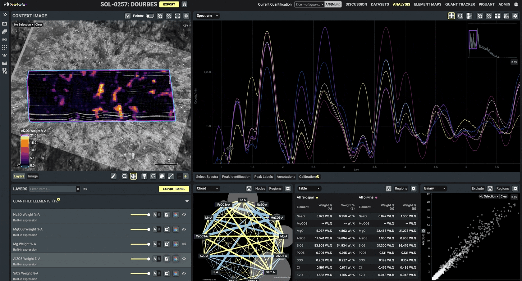
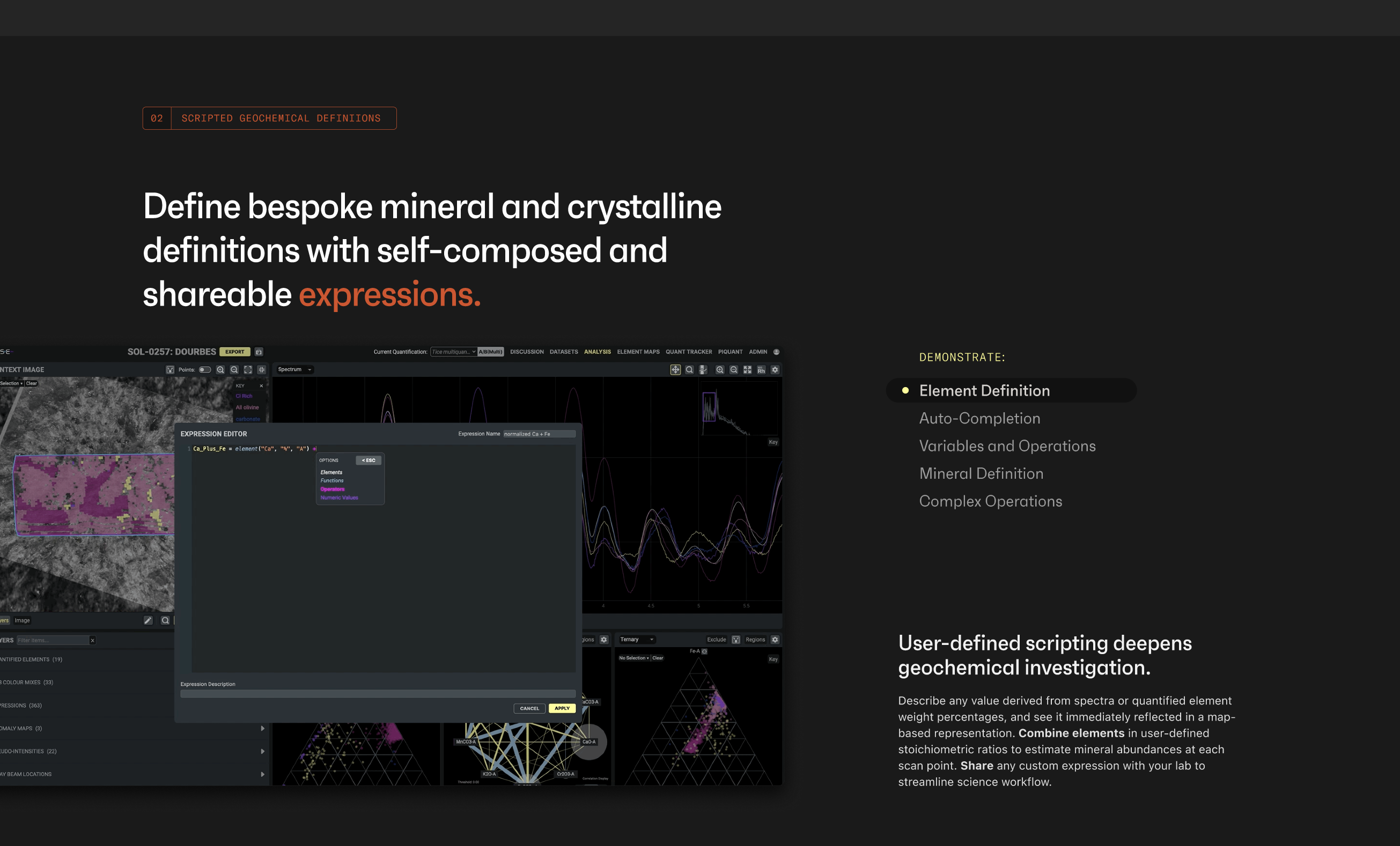
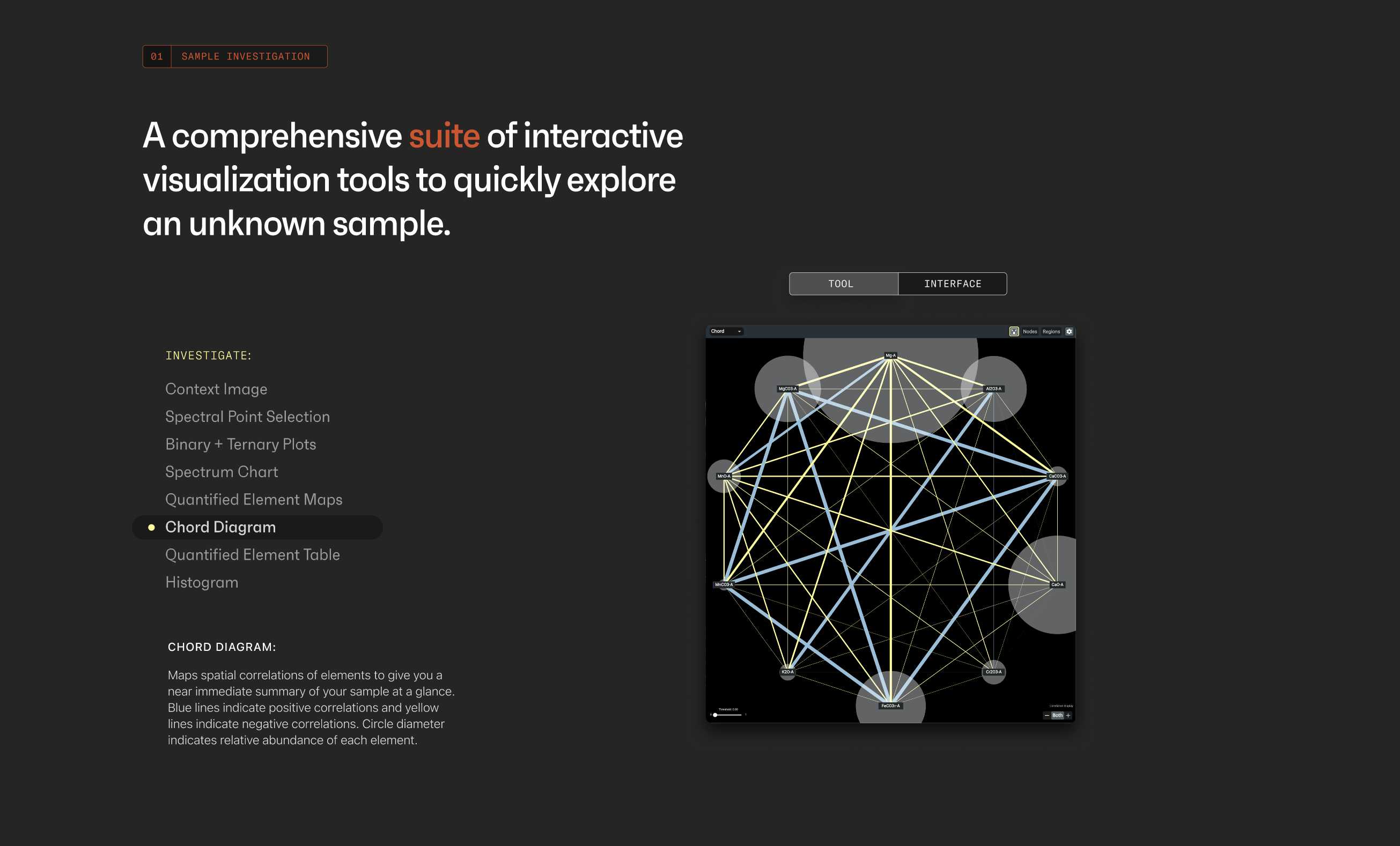
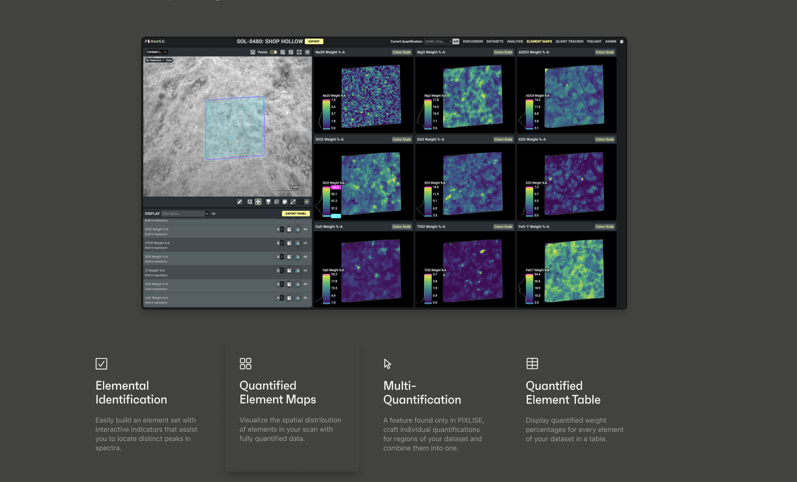
1. Grasp complex features in seconds
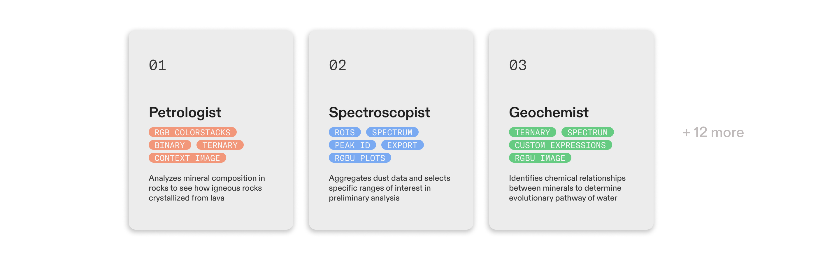
Depth interviews revealed PIXLISE’s core strength: flexiblity and accomodation for many types of scientists. The new site highlights PIXLISE’s ability to handle it all by breaking down all features into 3 core functions:
Workflow: how users cross-reference and collaborate
Quantification: how users validate data
Investigation: how users explore and analyze
2. Reimagine science collaboration
Generative inverviews with labs further highlighted the importance of tools supporting interconnected workflows.
The new site validates common lab science challenges and highlights novel collaboration perks. PIXLISE emphasizes the importance of the science community: guides and forums are just a click away.
3. Evaluate for fit and adopt
Finally, I replaced 1:1 product demos with tiered adoption options and PIXLISE Trial, enabling potential users to try features autonomously and choose a version of PIXLISE that fits their needs.
This reduced onboarding from weeks to minutes, allowing the product team to focus on shipping awesome features.
Explore the final prototype here.
Dig a little deeper into the process:
OPPORTUNITY
PIXLISE was designed to help scientists investigate the geological history of Mars in rock samples collected from the planet. Despite this specific use case, PIXLISE’s functions are applicable (and potentially revolutionary) to all elemental geoscience workflows.
The PIXLISE product team at NASA Jet Propulsion Laboratory approached me to distill its capabilities into a compelling story to engage a new world of users.
Mars science tools are useful for Earth scientists too
PIXLISE was designed to help scientists investigate the geological history of Mars in rock samples collected from the planet. Despite this specific use case, PIXLISE’s functions are applicable (and potentially revolutionary) to all elemental geoscience workflows.
The PIXLISE product team at NASA Jet Propulsion Laboratory approached me to distill its capabilities into a compelling story to engage a new world of users.

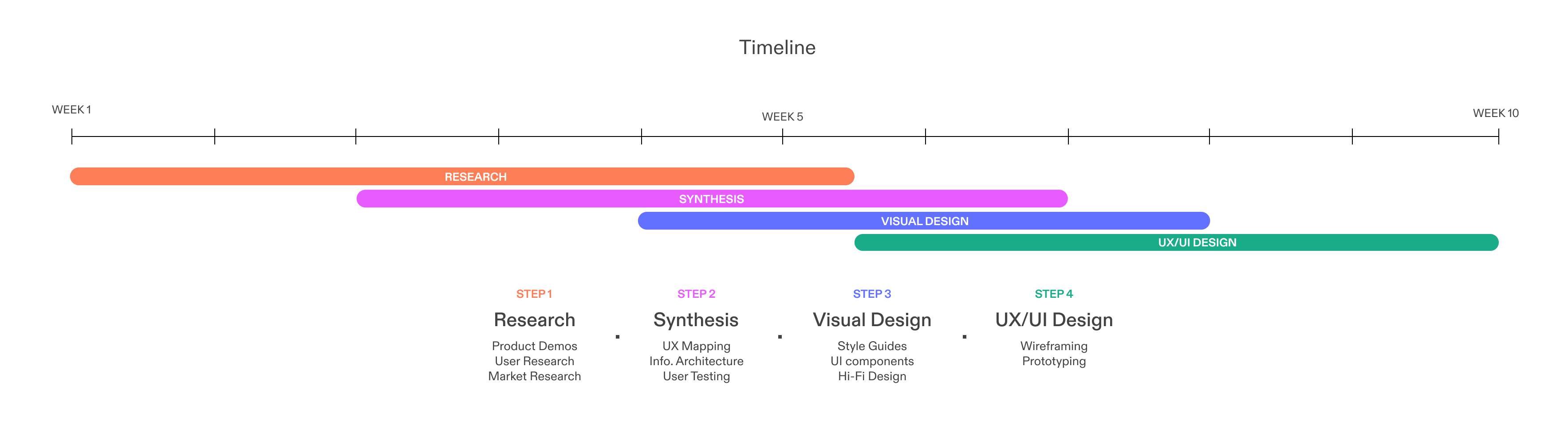
RESEARCH OVERVIEW
To say I was (and still am) a beginner at planetary geoscience is an understatement. With research, I grew a deep understanding of PIXLISE’s capabilities and uncovered how the Mars use case and overarching NASA mission objectives differentiate PIXLISE from market software in a favorable way.
Crash course in the product, existing users, business, and competition
To say I was (and still am) a beginner at planetary geoscience is an understatement. With research, I grew a deep understanding of PIXLISE’s capabilities and uncovered how the Mars use case and overarching NASA mission objectives differentiate PIXLISE from market software in a favorable way.
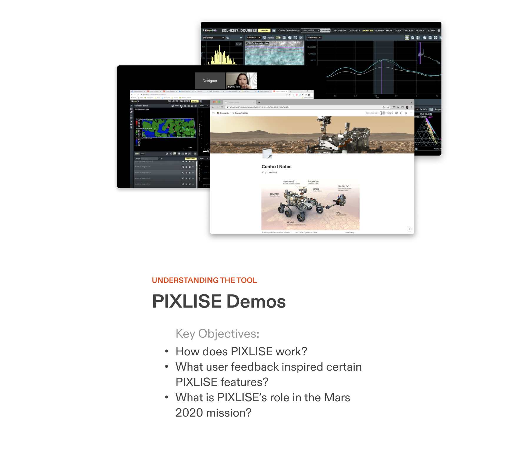

Custom Notion setup to stay organized!
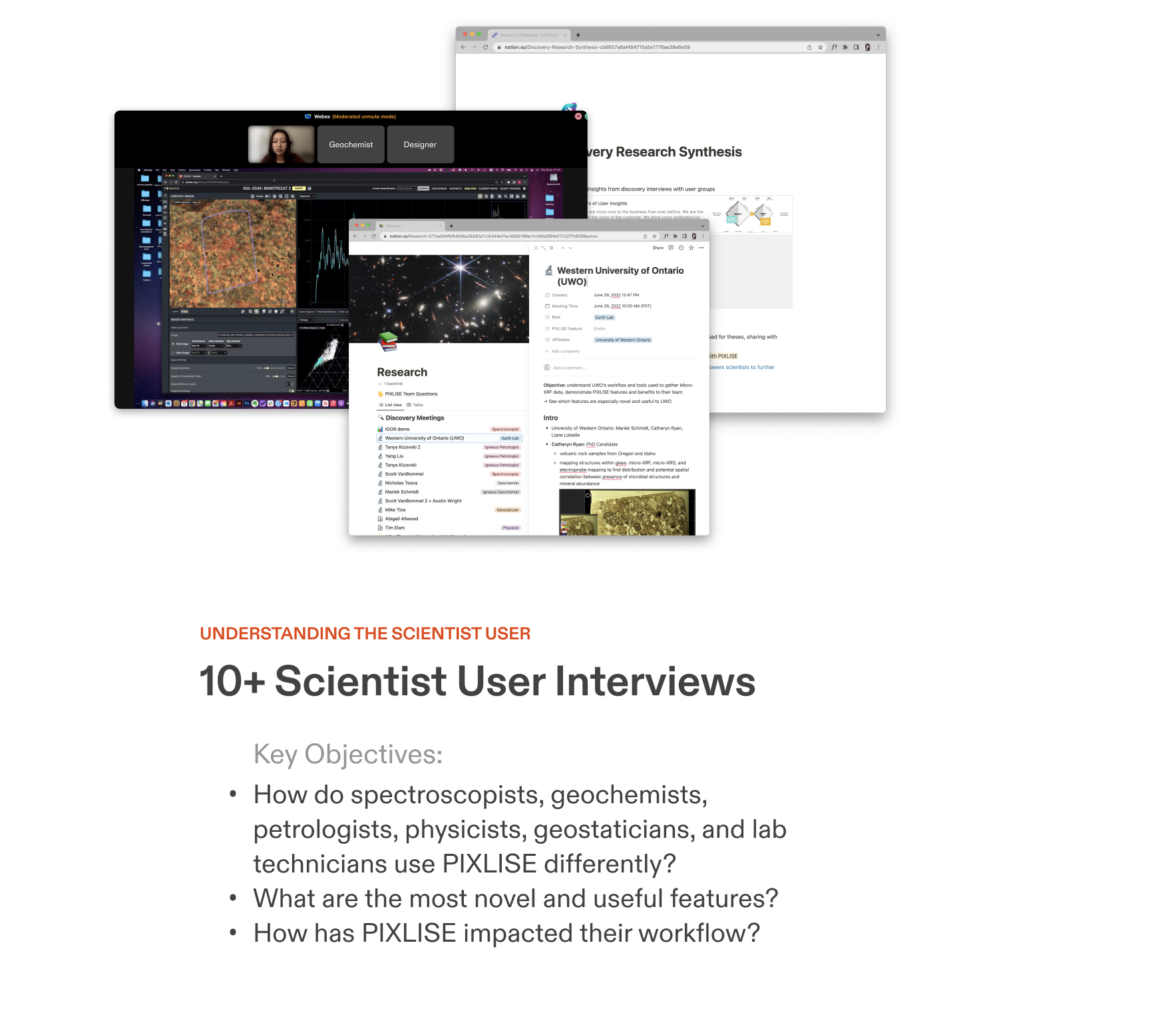
INFO ARCHITECTURE / TAXONOMY
There’s no one “happy path” in scientific investigation. Through 15+ interviews and demos with scientist users, we were initially overwhelmed with the high variation in the features used and the ways they are utilized.
Diverse user workflows require detailed content organization
There’s no one “happy path” in scientific investigation. Through 15+ interviews and demos with scientist users, we were initially overwhelmed with the high variation in the features used and the ways they are utilized.
Despite this variation, I found patterns through prototyping (rough) artifacts and reviewing them with the product team and scientist experts.
I devised a comprehensive organization of product feature information with seven levels of granularity. At the highest level, PIXLISE is characterized by flexibility (in workflow), speed (in quantification), and innovation (in investigation).
I devised a comprehensive organization of product feature information with seven levels of granularity. At the highest level, PIXLISE is characterized by flexibility (in workflow), speed (in quantification), and innovation (in investigation).


The clear, structured taxonomy translated gracefully into the Landing and Product page wireframes, and is a huge improvement to the 4 cards on the site previously.

INFO ARCHITECTURE / USER FLOW
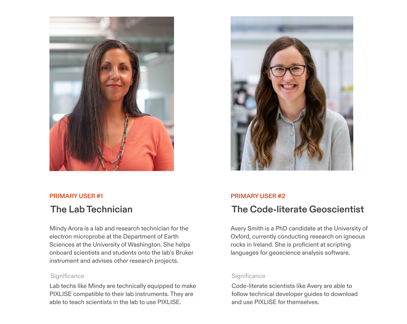
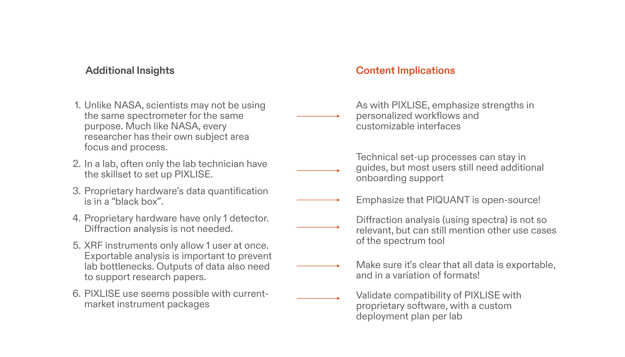
Despite a limited access to our target user, speaking to the UWO’s XRF lab validated a need for PIXLISE on Earth and allowed us to step in the shoes of research lab scientists.
Lab challenges illuminate a plan for deploying PIXLISE
Despite a limited access to our target user, speaking to the UWO’s XRF lab validated a need for PIXLISE on Earth and allowed us to step in the shoes of research lab scientists.
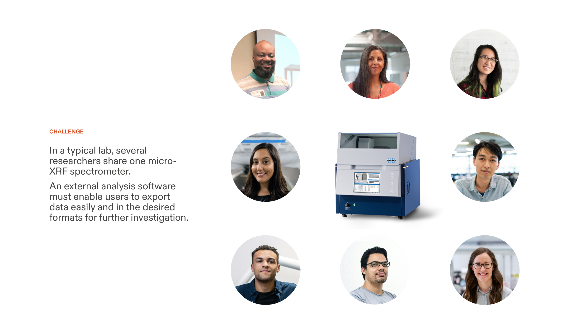
We envision users to imagine how PIXLISE can transform their lab’s research.
I devised a tiered deployment plan to scaffold techical barriers to entry: First, try PIXLISE with sample data. Then, secure PIXLISE for your lab when you know it’s a good fit. Later, experience PIXLISE at peak performance with cloud-parallelized computing.
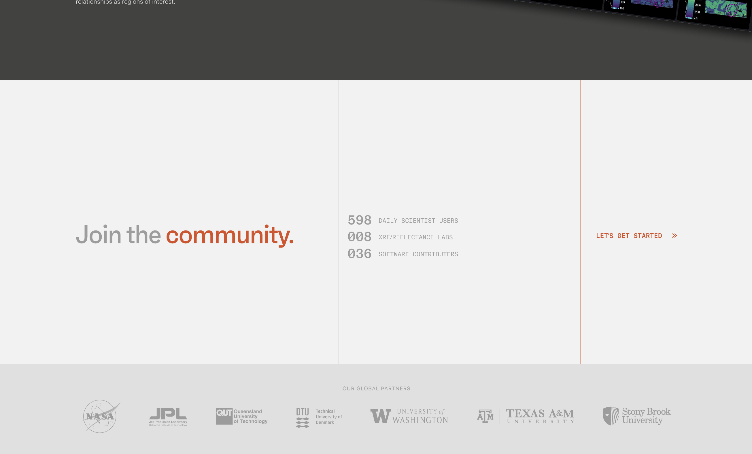
We further simplified PIXLISE adoption with an ever-present “Try PIXLISE” button on the global navigation and a concise and engaging call to action and community metrics to end every page on the site.
INFO ARCHITECTURE / STORY
We can’t lose PIXLISE’s unique history in a universe of awesome features. In the Mission page, we highlight the Mars story as an additional reason to love PIXLISE. PIXLISE’s “mission” statement strategically follows its origin story and continued presence in NASA’s flagship Mars 2020 mission.
Supporting function with an out-of-this-world narrative
We can’t lose PIXLISE’s unique history in a universe of awesome features. In the Mission page, we highlight the Mars story as an additional reason to love PIXLISE. PIXLISE’s “mission” statement strategically follows its origin story and continued presence in NASA’s flagship Mars 2020 mission.
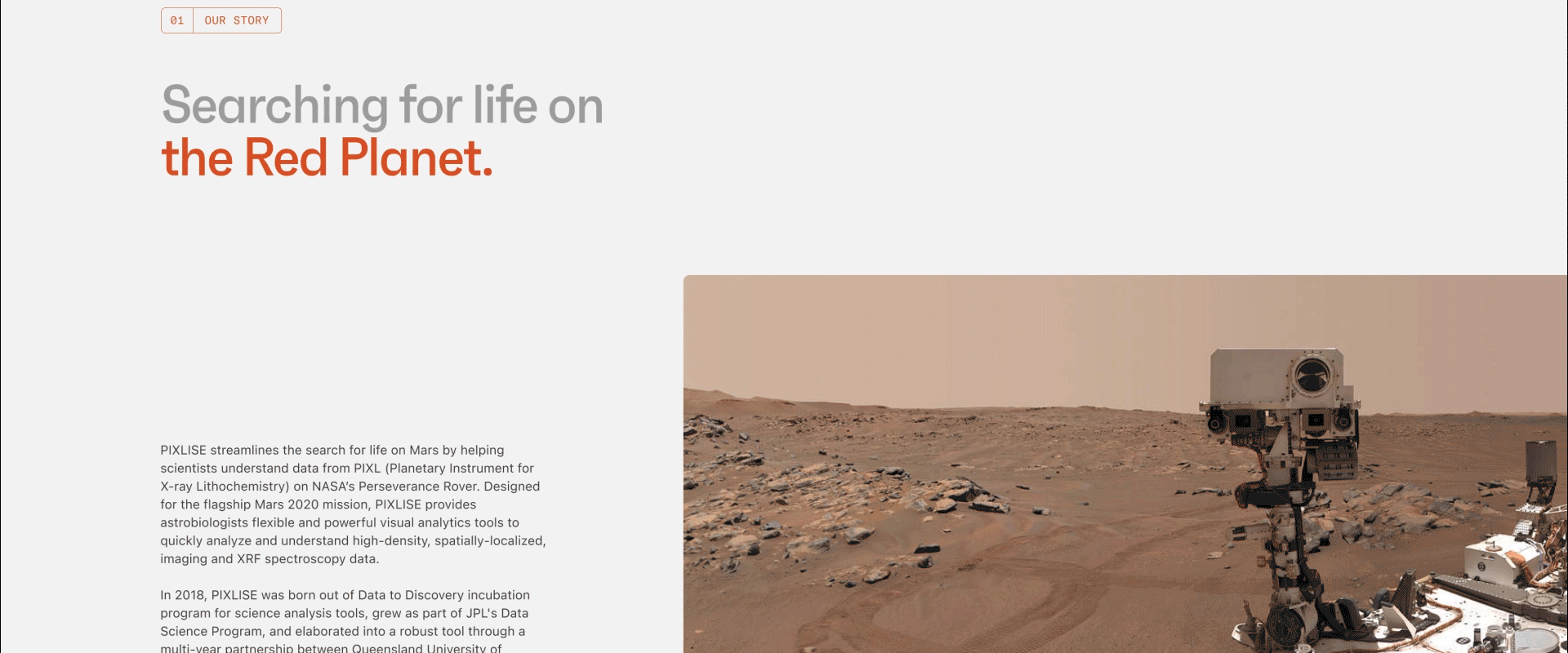
This completes the arc of the public PIXLISE experience:
Show off product features first, reinforce with community resources, and seal the deal with an otherworldly mission statement.
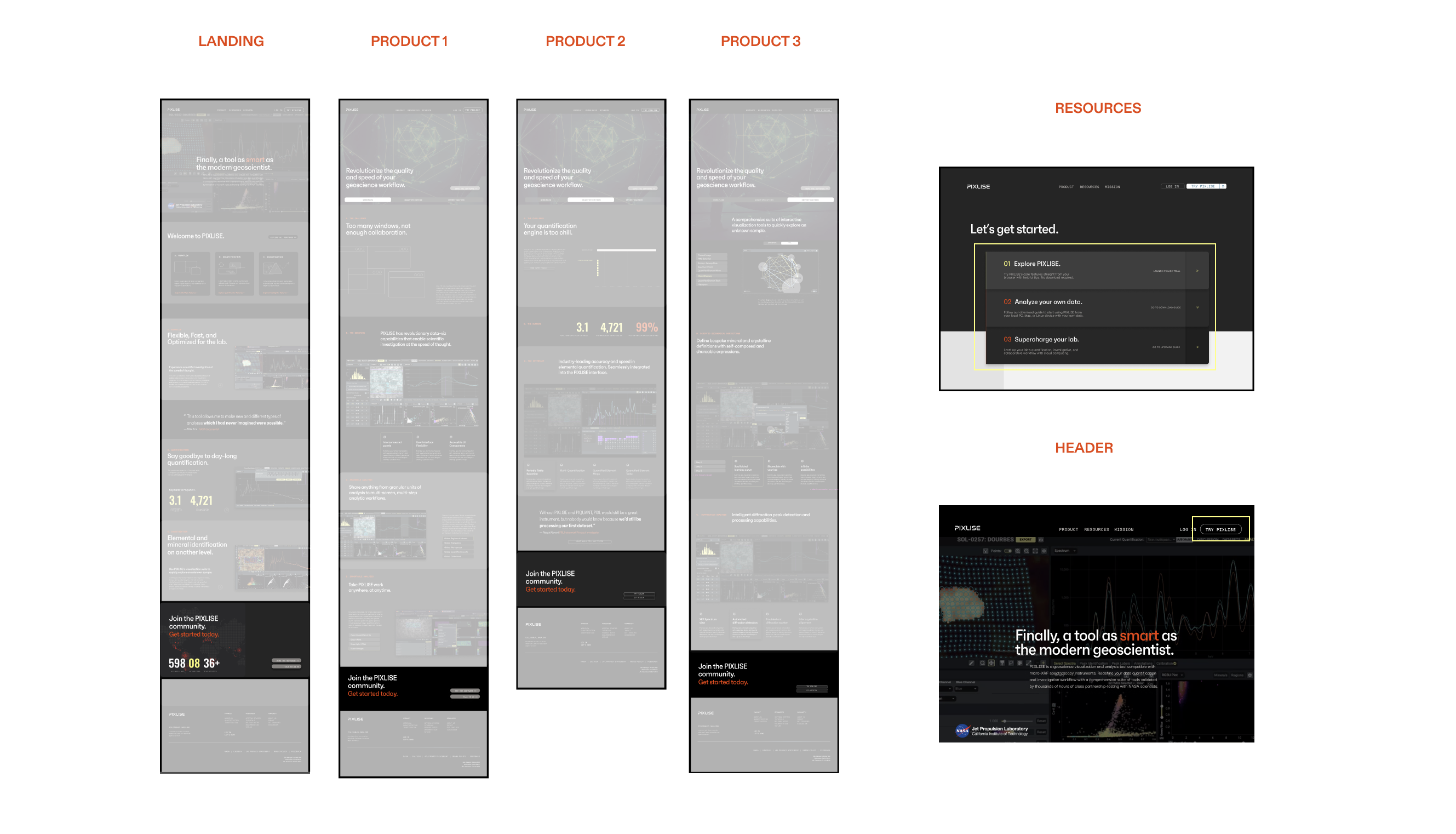
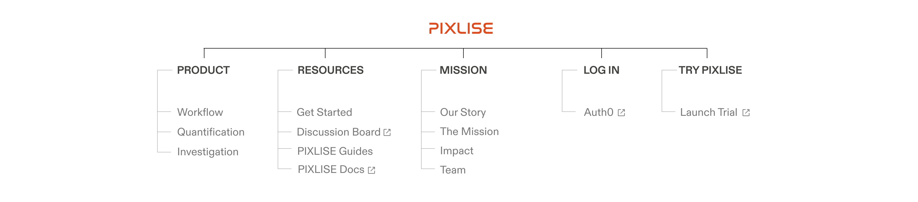
Site Map
IDENTITY
The visual design reflects the sophistication and quality of the revolutionary tool, while maintaining a tone of warmth through its mission to support the science community.
Refreshed design system reflects new product values
The visual design reflects the sophistication and quality of the revolutionary tool, while maintaining a tone of warmth through its mission to support the science community.


Working with the product team, we were able to scale this identity into a design system for implementation.

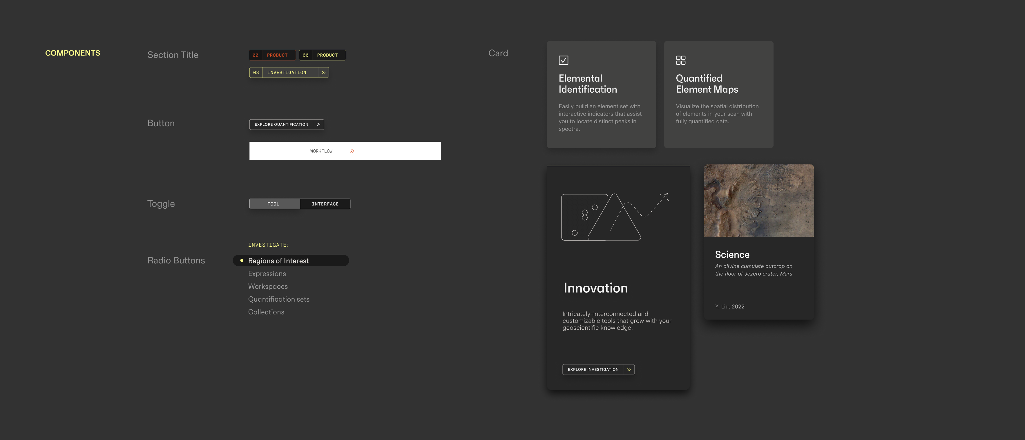
The final visual system retains the dark look of the UI. We highlight with PIXLISE’s recognizable yellow spot color, now coexisting with an additional poppy vermillion, inspired by Mars. An energetic type duo ties it all together: the geometric yet approachable sans serif Faktum and the clean monospace variation of GT America.
COMMUNICATION DESIGN
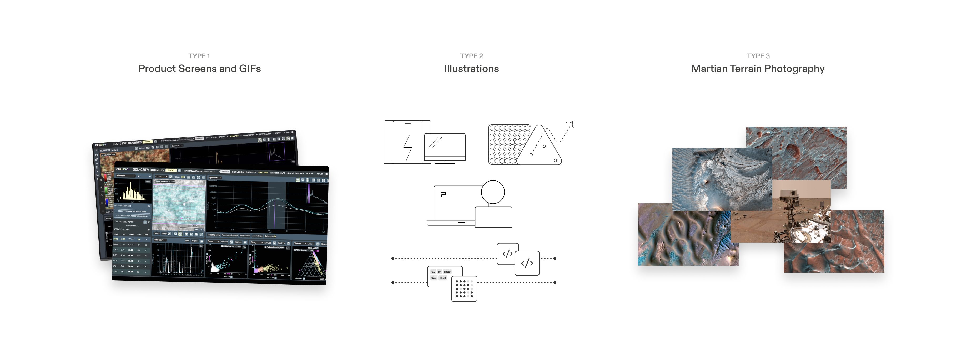
At first, I relied solely on product screens to supplement the copywriting. Although great for demonstrating how a scientist might use PIXLISE, these failed to communicate abstract product benefits, such as “real-time collaboration” or “open-source web access.”
Optimizing visuals for a science audience
At first, I relied solely on product screens to supplement the copywriting. Although great for demonstrating how a scientist might use PIXLISE, these failed to communicate abstract product benefits, such as “real-time collaboration” or “open-source web access.”

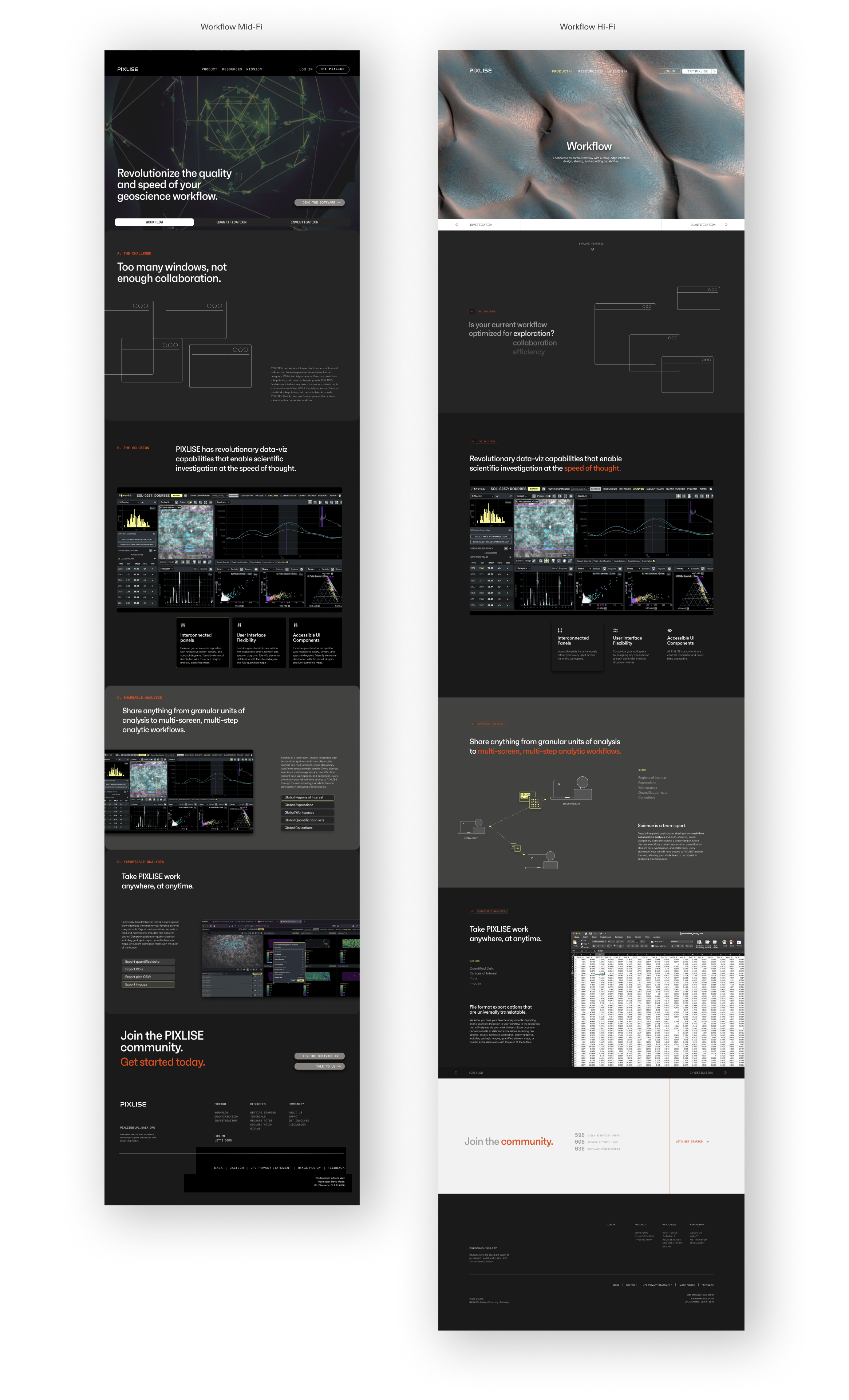
In later iterations, using lighter backgrounds afforded a refreshing differentiation from the product UI. Simple illustrations helped convey higher-level concepts and high-res geography photos supplemented context and atmosphere.
Finally, microinteractions added dimension to the web experience:
︎ With every refresh, the landing page shifts to reflect PIXLISE’s impact.
︎ Survey product features quickly by clicking on the informational cards.
︎ Easily navigate between the three core product functions: Workflow, Quantification, and Investigation.
︎ Immediately grasp tool functionality by switching between an isolated panel view and an in-context workspace view.
Interact with the final prototype here.
REFLECTION
Despite the ambiguity of our target user and high level of content complexity, I designed a product’s growth strategy and public interface for implementation within 10 weeks. Though not without struggle, by far my greatest breakthrough was learning to be wrong, so we can get it right together.
Learnings and next steps
Despite the ambiguity of our target user and high level of content complexity, I designed a product’s growth strategy and public interface for implementation within 10 weeks. Though not without struggle, by far my greatest breakthrough was learning to be wrong, so we can get it right together.
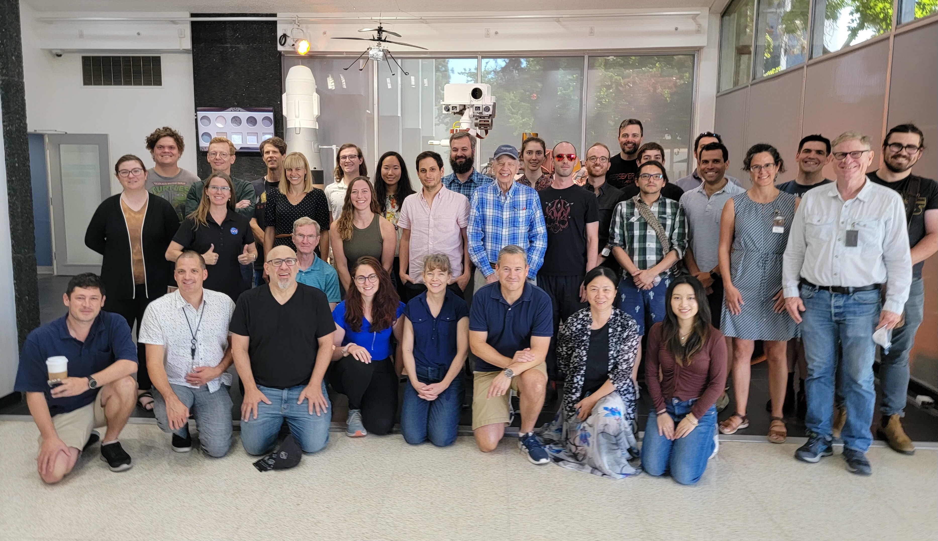
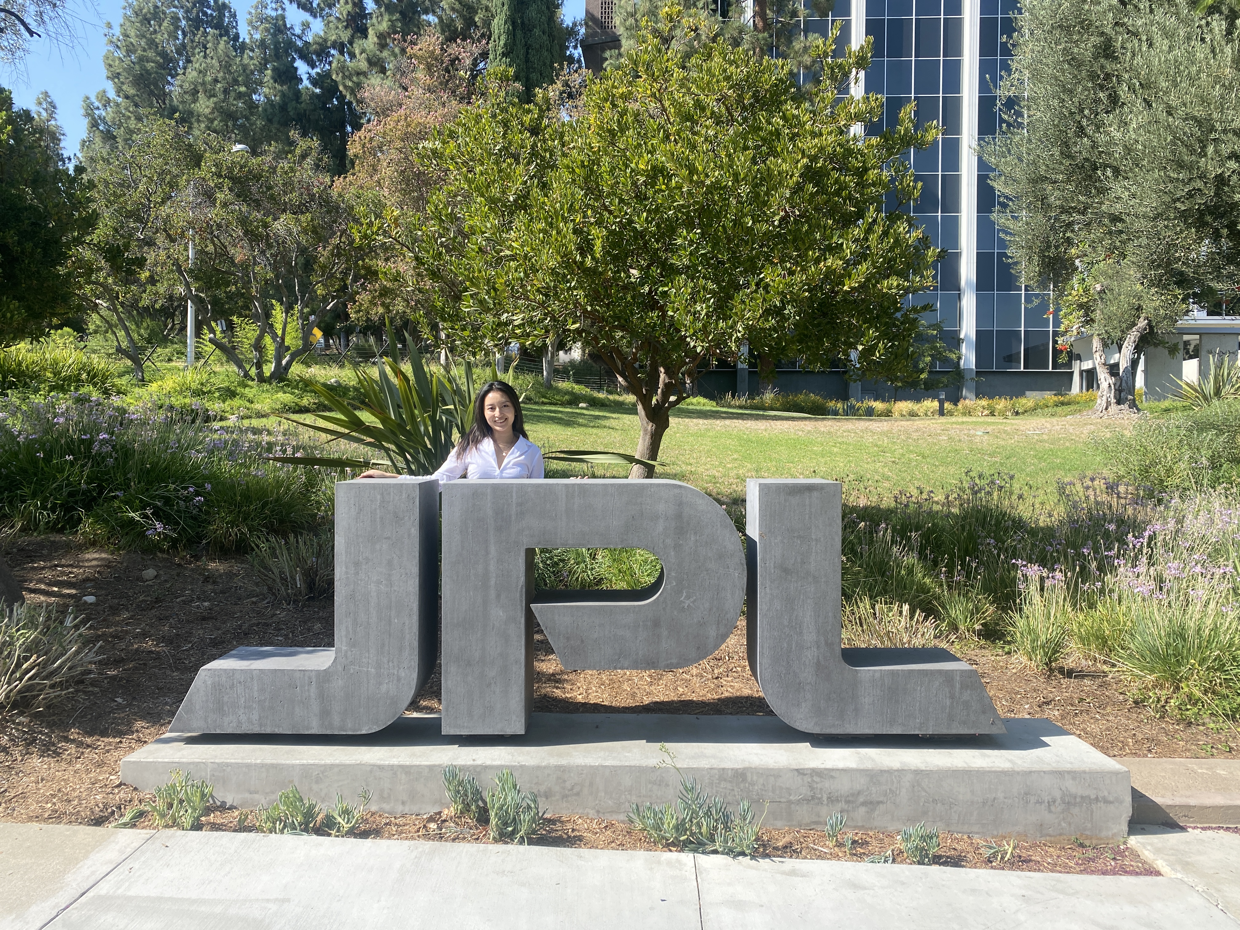
Image 1: 2022 PIXL Team photo!
Image 2: Obligatory JPL sign picture :)
Image 2: Obligatory JPL sign picture :)
More learnings:
Writing is design. Balancing precision, concision, and accuracy with something more “punchy” and “marketable” was hard and required its own iterative process.
Asking good questions is good, but prototyping wrong solutions is better. I had to confront my perfectionism in the face and build out some terrible artifacts before they started to become clear. The goal is to move the needle forward.
Design creates access. Working with technical stakeholders helped me contextualize the importance of design in a high-complexity setting. Seeing design’s ability to bridge connections, disciplines, workflows, and understanding within just a few months made the challenges along the way so worthwhile.
If given more time and money, I’d:
Access more Earth labs. It was challenging extrapolating findings with limited access to our target user. In an ideal world, I would interview and test with more earth scientists to validate site success.
Build out guides. PIXLISE is not easy to learn and user support is necessary to troubleshoot and adapt to software changes. I’d love to continue working with users and PIXLISE developers to build user-friendly guides for user autonomy.
Be more hands-on with deployment.
Through this experience I realized I enjoy working with eng stakeholders to ensure ideas are grounded in reality. If afforded more time I’d love to be more involved with designing the back-end for PIXLISE’s sustained growth.
Presenting the website to the Mars 2020 PIXL science team was the most gratifying moment of my career to date. I got to see scientists react to my process and get a glimpse of the positive impact design can have on scientific inquiry. This project reinforced my belief in the necessity of human-centered design.
2024 Update—
Now, I’m working on strategic visual communication solutions for science/engineering at NASA JPL, see here︎︎︎.
2024 Update—
Now, I’m working on strategic visual communication solutions for science/engineering at NASA JPL, see here︎︎︎.
